openmrs-esm-patient-chart
What is this?
openmrs-esm-patient-chart is a patient dashboard microfrontend for the OpenMRS SPA. It provides a simple dashboard with cards detailing the patient's information, such as vitals, demographic and relationships.
For more information visit:-
https://github.com/openmrs/openmrs-esm-patient-chart
How do I install this?
Requirements: Java 8, Latest NodeJS & NPM, Latest Git, Latest OpenMRS Platform with the Latest SPA Module installed
Currently, there are no compiled releases for openmrs-esm-patient-chart. To obtain this module, use the following steps:
git clone https://github.com/openmrs/openmrs-esm-patient-chart
- cd openmrs-esm-patient-chart
- npm install
- npm run build
- Serve the built dist/openmrs-esm-patient-chart.js and configure it in your SPA Module's root-config
Then, have a look at the O3 Implementer Documentation: Set Up, Configure & Deploy for installing microfrontends for the SPA Module.
How do I use this?
openmrs-esm-patient-chart is registered as a core application inside of openmrs-esm-root-config. This means that it will automatically activate whenever you are on one of the frontend routes that it controls. The openmrs-esm-patient-chart module serves the route "(spa root)/patient/:uuid/chart".
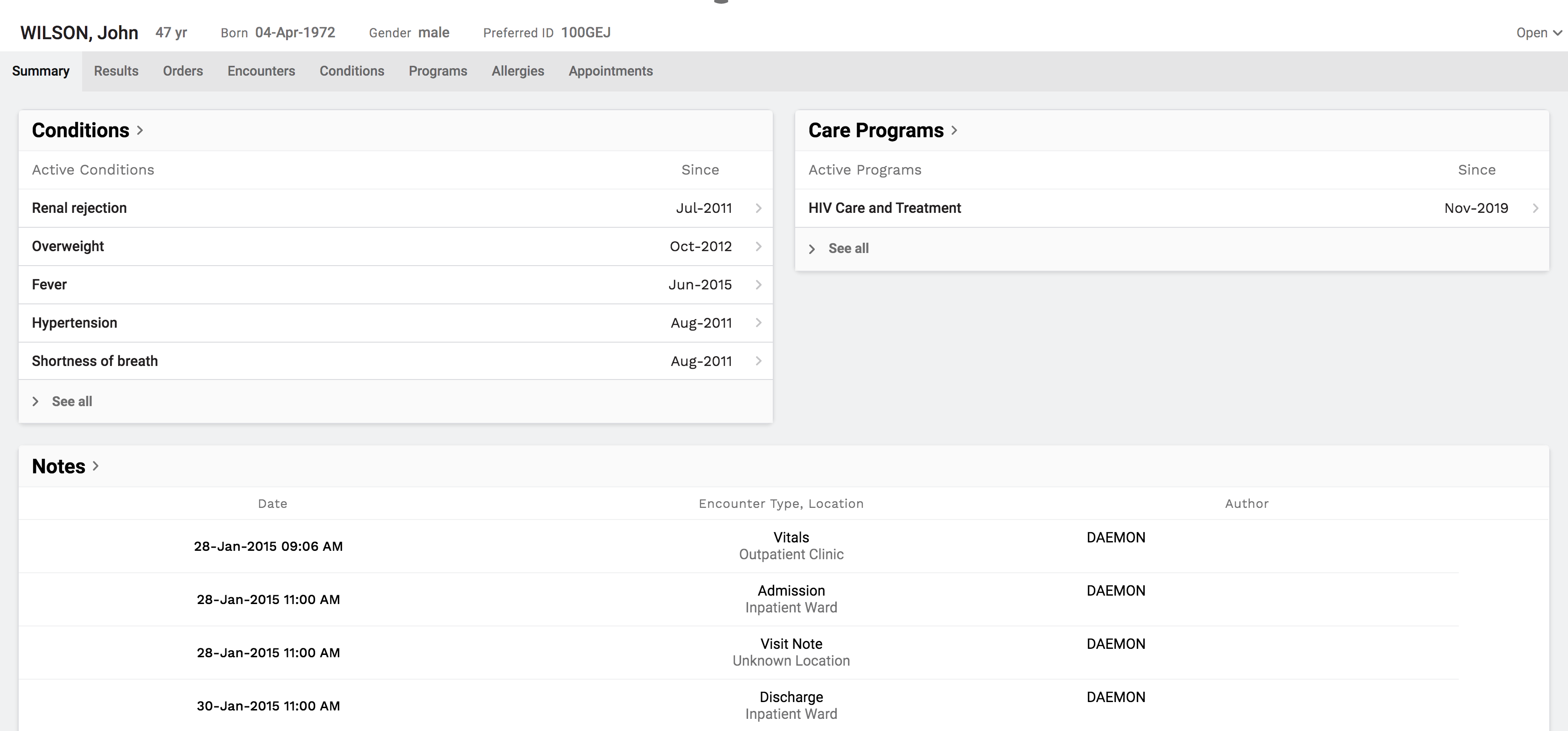
What is the layout of patient chart?
openmrs-esm-patient-chart consists of four parts: patient banner, primary navigation, chart review and a workspace.
Patient banner: This is always displayed at the top of the screen. It displays the patients name, age, birthdate, gender and the preferred OpenMRS identifier for that patient. Additional demographic data may be displayed by clicking on more. Presently, there are no configuration options for this component.

Primary navigation: This component is presently rendered underneath the patient banner and renders items horizontally. The default setting displays the following items: Summary, Results, Orders, Encounters, Conditions, Programs, Allergies, Appointments. This is a rapidly changing area of the module and the preceding items are frequently changing. The primary nav bar is 100% configurable. An implementation can utilize any of the core widgets (please see openmrs-esm-patient-chart-widgets to learn more) or utilize widgets from an external es6 module.

Chart review: The chart review section is the primary area of the window for displaying historical patient data. It will use the whole screen under the navigation bar unless the workspace is active (which utilizes the right side of the screen). Click on items in the navigation pane will cause them to render here.
Workspace: The workspace exists to allow a user to simultaneously be "doing" work, e.g. writing a note, placing an order, etc, while reviewing patient data.
How do I configure this module?
This module is is designed to be driven by configuration files. openmrs-esm-patient-chart itself contains no components for displaying patient data itself. Instead, the implementation must use either the default configuration (see below) or create it's own configuration to drive the patient chart. This was meant to add maximal flexilibility to allow an implementation to decide what they wanted to display to their users. Moreover, configurations can be hot-loaded such that different configurations could be used to support different user roles.
Please see esm-module-config for technical details about adding a configuration to your implementation.
The following discusses the specifics of creating a configuration for this module. A patient chart configuration consists of four primary sections: primaryNavbar, widgetDefinitions, dashboardDefinitions, tabbedViewDefinitions. We will discuss each of these in sections and then provide a comprehensive example of a configuration file at the end.
At it's heart, this is a relatively straightforward system for creating routes which are mapped to user defined views. We provide three types of views a widget, a dashboard and a tabbedView.
Widgets
At it's core, a widget is simply a component. Presently, the majority of work on this application has been using react. A widget might be something like a card displaying conditions, or a set of cards for displaying orders. Widgets are defined using the widgetDefinitions configuration option.
{
"widgetDefinitions": [
{
"name": "myWidget",
"esModule" : "@my-moodule-with-widgets
}
]
}
The chart rendering engine will attempt to load the above module, using SystemJS to dynamically load my-module-with-widgets. Note: this module must be listed in your import map in order for SystemJS to be able to import it. Please see here for more instructions on managing your import map. On import, System.JS provides an es6 module. Based on the above configuration, the rendering engine expects there to be a property within the module called "myWidget". If you are creating your own module to serve widgets, please be sure to use the exact same name to export the widget as you use in the widget definition.
Dashboards
A dashboard is a collection of widgets with a layout. We provide a simple layout manager to make it relatively straightforward to configure your dashboards. A dashboard definition consists of the following
{
"name": "dashboardName"
"title": "title of dashboard"
"layout": {
"columns": n
}
"widgets": [
{
"name": "widget1",
"esModule" : "@widget1-module"
"layout" : {
"columnSpan": n
"rowSpan": n
}
},
{
"name": "widget2",
"esModule" : "@widget2-module"
}
]
}
Dashboards make it relatively straight forward to take a collection of widgets and display them using a grid layout (see css-grid, if you're interested). The layout is simple, it allows a user to say how many columns will be in the grid. You specify this in the config under layout.columns. Within the widgets configuration, you can also specify the number of columns and/or rows you want the widget to occupy using layout.columnSpan and layout.rowSpan properties within the widget. The widgets are rendered in the order they are listed in the config. An example may illustrate things more clearly. Let's set up a dashboard with 4 columns. If widget1 is set to 3 columns, and widget2 is set to 2 columns, then widget1 will be displayed on the first row. Because 3 + 2 = 5 > 4, widget2 will be bumped to the next row and occupy the first two columns. If no layout is specified in the configuration, the dashboard will default to using 1 column and 1 row to display the widget.
TabbedViews
TabbedViews exist to support scenarios where the user may want to have a second level of navigation under the primary navigation bar. In configuration consists solely of defining a name, title and navbar:
{
"name": "myTabbedView",
"title": My Tabbed View",
"navbar": [
{
"label": "View 1",
"view": "view1"
"path": "/view1
},
{
"label": "View 2",
"view": "view2,
"path": "/view2"
}
]
}
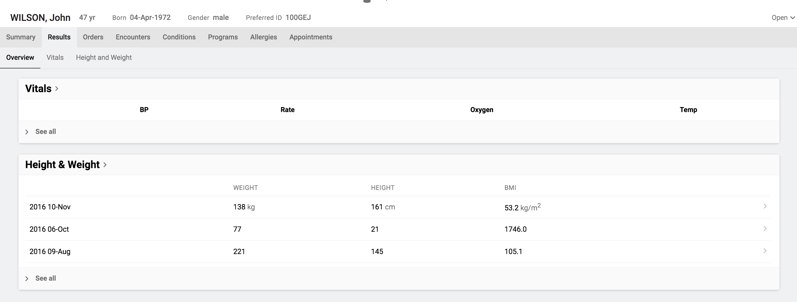
The above uses the following configuration:
{
name: "resultsTabbedView",
title: "Results",
navbar: [
{
label: "Overview",
path: "/overview",
view: "resultsOverviewDashboard"
},
{
label: "Vitals",
path: "/vitals",
view: "VitalsSummary"
},
{
label: "Height and Weight",
path: "/heightAndWeight",
view: "HeightAndWeightSummary"
}
]
}
In the next section, we discuss the primary navigation bar which uses an identical configuration set up as the navbar in the TabbedView. We discuss the properties within the navbar configuration below.
Primary navigation bar:
{
"primaryNavbar": [
{
"label": "Summary",
"view": "summaryDashboard"
"path": "/summary"
},
{
"label": "Results",
"view": "resultsTabbedView"
"path": "/results"
},
{
"label": "Conditions",
"view" : "conditionsOverview",
"path" : "/conditions"
}
]
}
The above will generate a primary navigation bar with three items. The configuration for an item includes three required properties: label, view and path. The label is what will be displayed to the user on the navigation bar. View is a generic term we will use to refer to what will be displayed by clicking on the link. We have created three views: widgets, dashboards and tabbedViews. Please see below for a detailed description of these concepts. The path property is provided so that you can link to these features from within widgets you create. In the example above, a route will be created to serve conditionsOverview widget at /patient/:patientUuuid/chart/conditions.
This widget may now be referenced in the primaryNavbar (or in a tabbedView) by setting the "view" property of the navbar to the name of the widget. For example, we could have the following:
...
{
"label": "My Widget",
"view" : "myWidget",
"path" : "/mywidget"
}