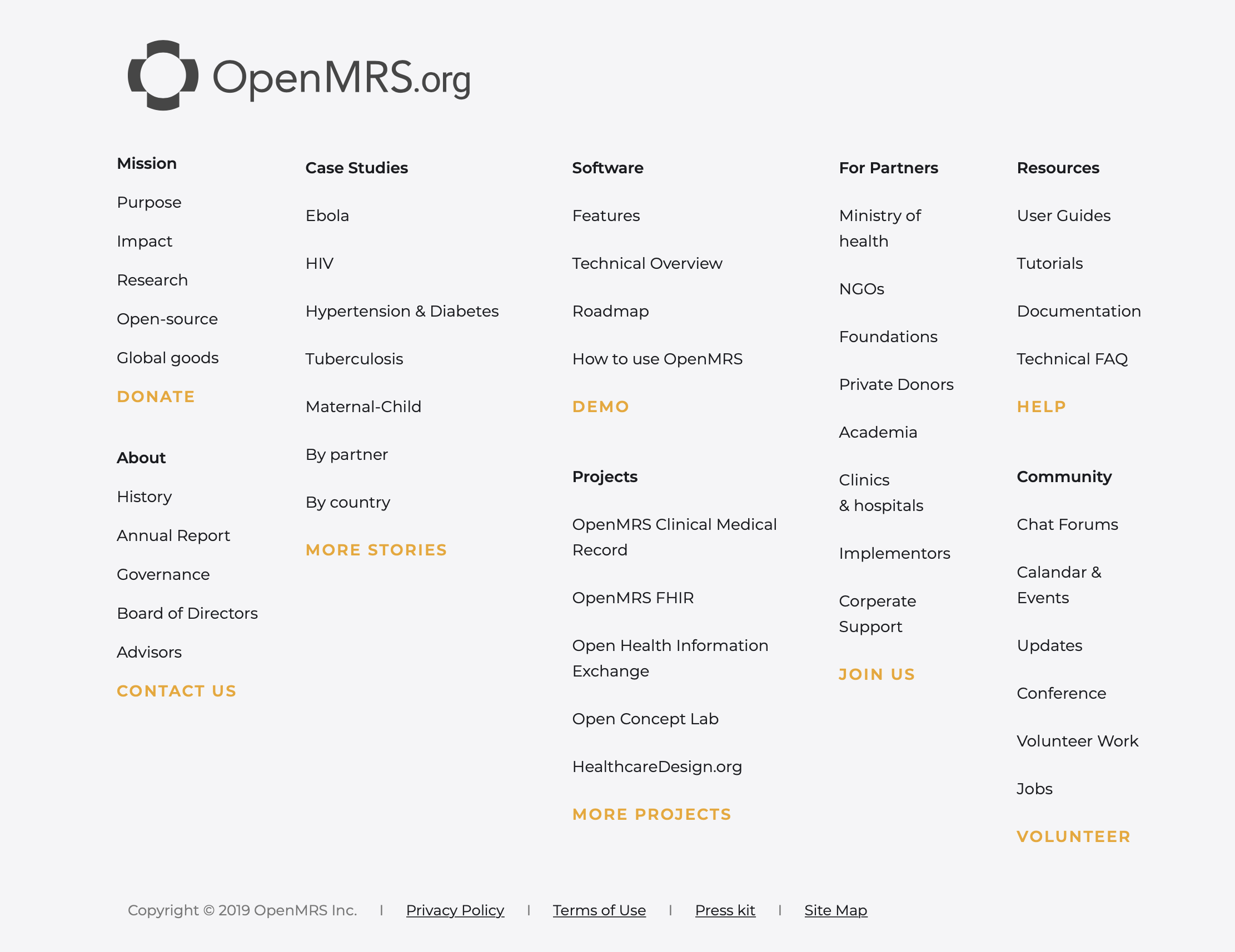
OpenMRS Brand Color - Contrast Study
The historical OpenMRS brand colors (OpenMRS Logo Policy) pose significant usability concerns when using them on white or grey backgrounds as text.
The low color contrast ratio makes them undesirable to use for primary action buttons as most fail both AA and AAA Accessibility Guidelines.
WCAG Guidelines
"WCAG 2.0 level AA requires a contrast ratio of at least 4.5:1 for normal text and 3:1 for large text. WCAG 2.1 requires a contrast ratio of at least 3:1 for graphics and user interface components (such as form input borders). WCAG Level AAA requires a contrast ratio of at least 7:1 for normal text and 4.5:1 for large text.
Large text is defined as 14 point (typically 18.66px) and bold or larger, or 18 point (typically 24px) or larger."
OpenMRS Brand Colors - Contrast Study
Summary
| OpenMRS Color | Color-contrast acceptability based on white/light grey |
|---|---|
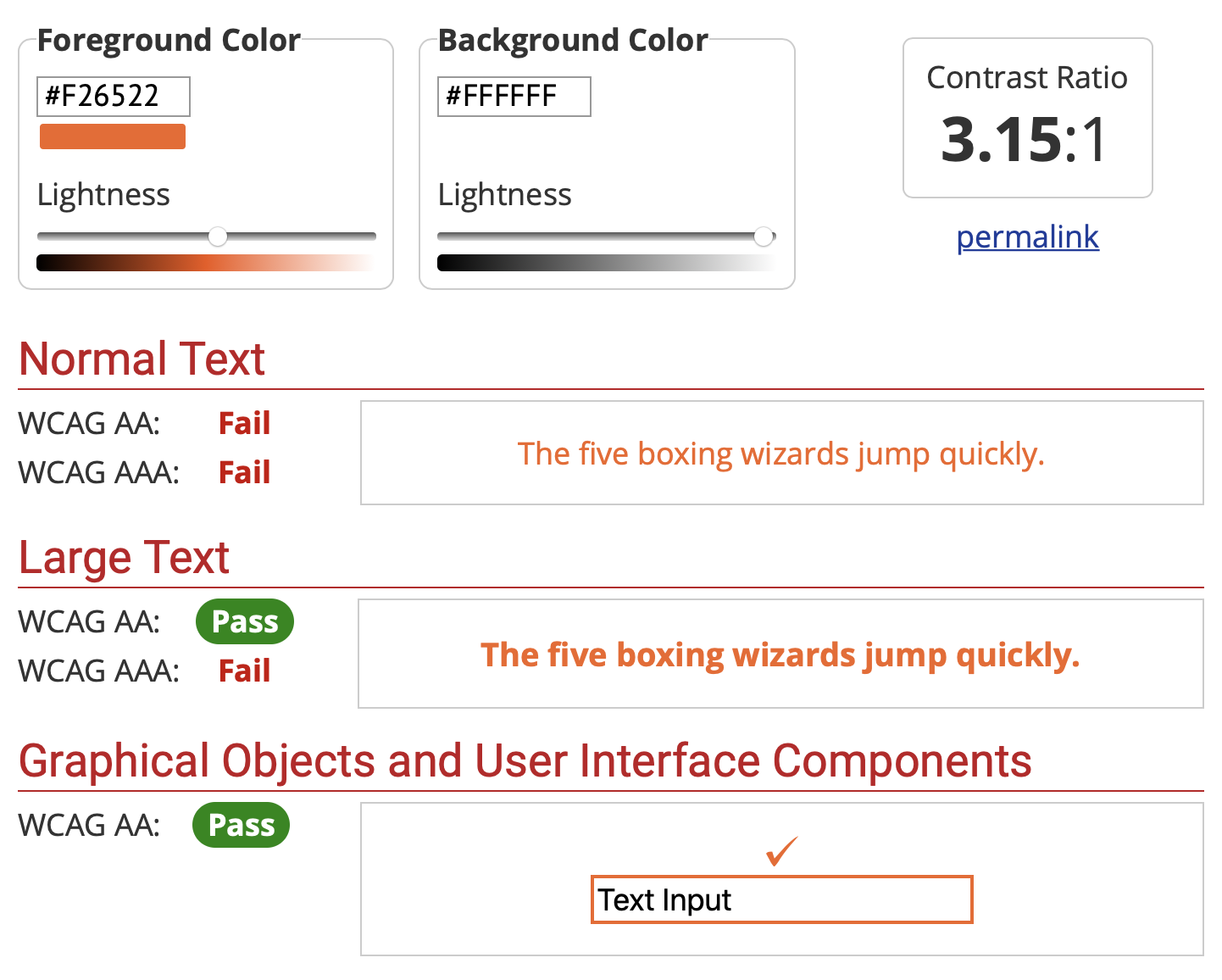
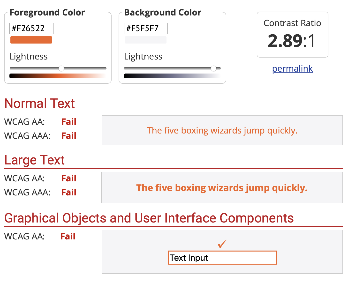
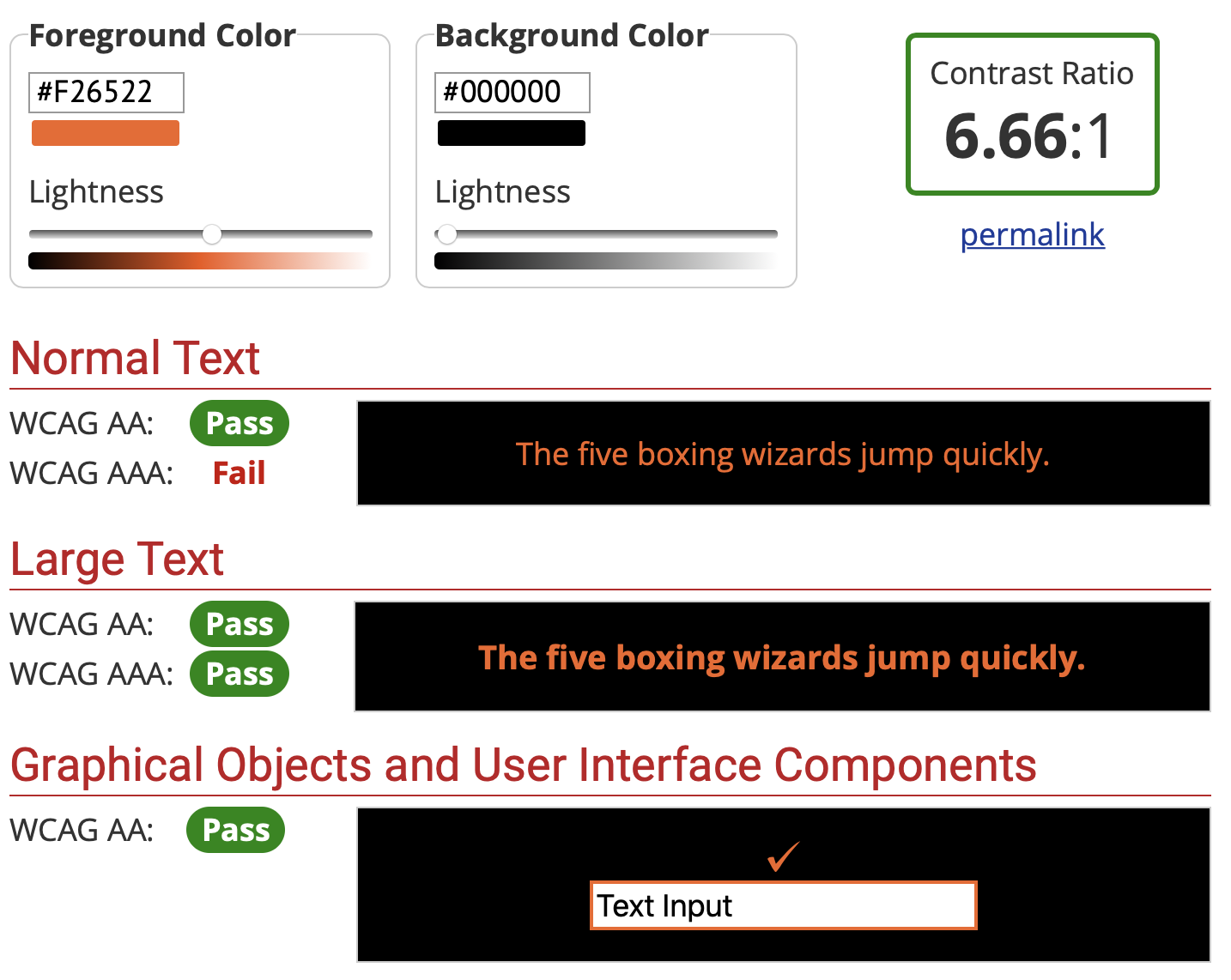
| Orange #F26522 | Epic fail |
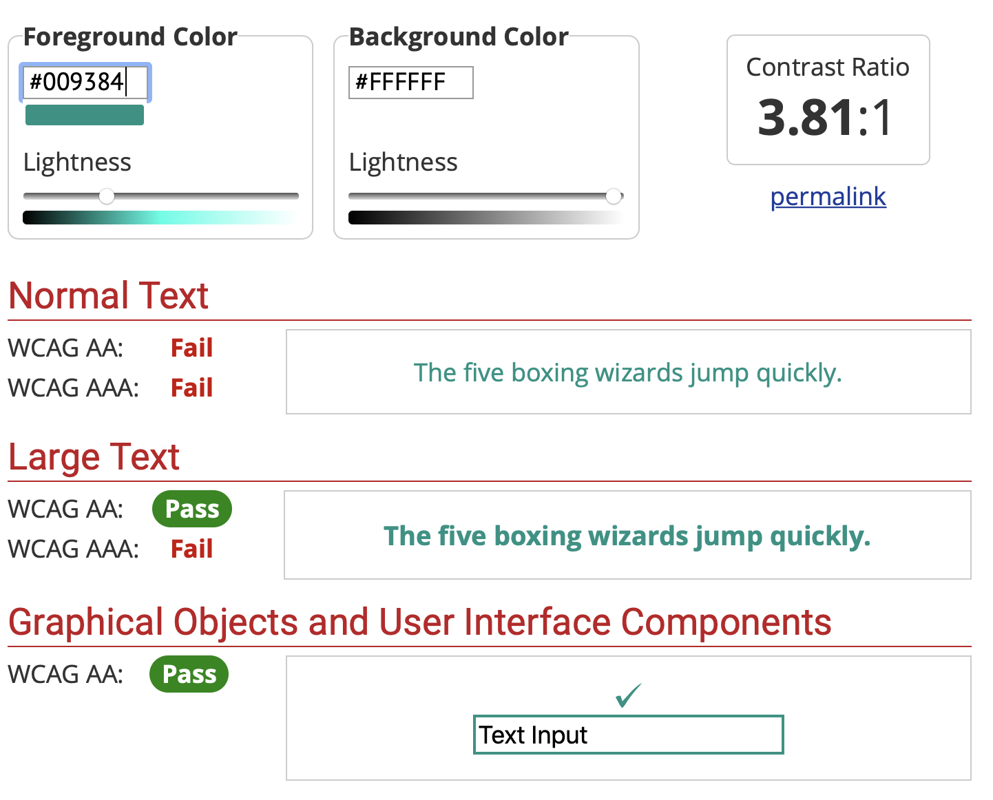
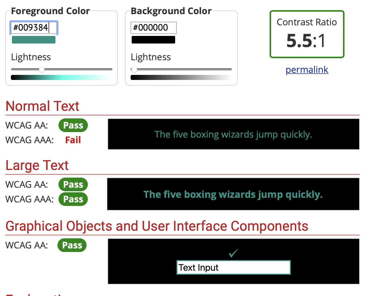
| Teal #009384 | Fail |
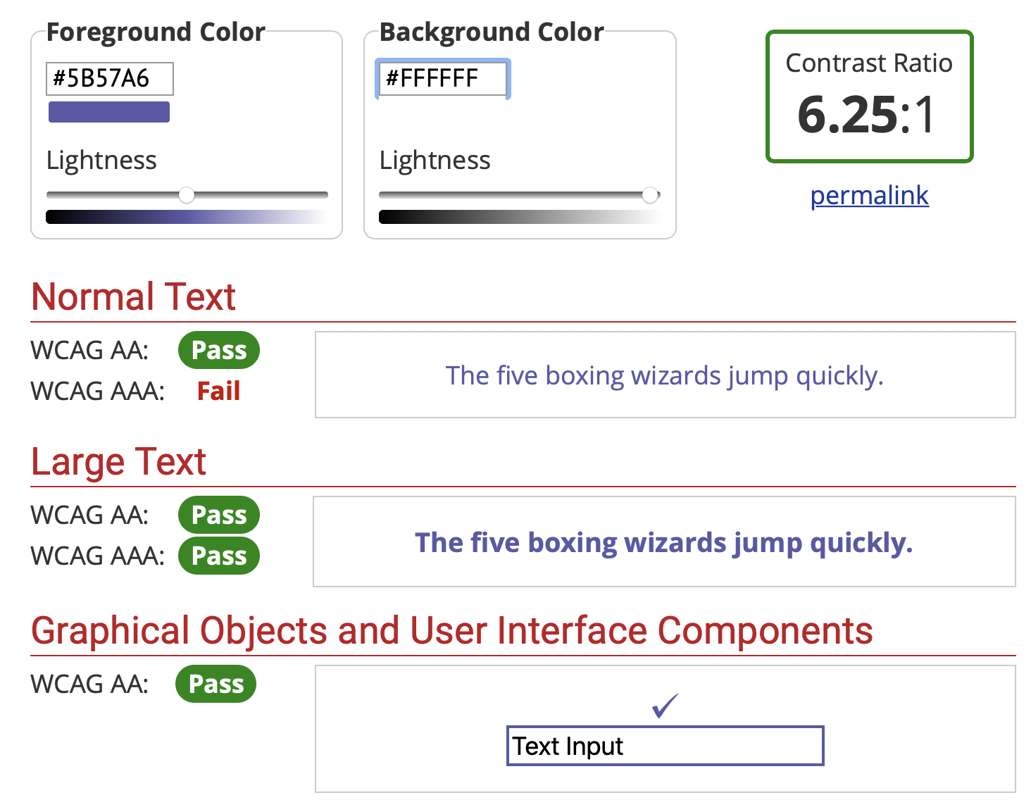
| Violet: #5B57A6 | Pass |
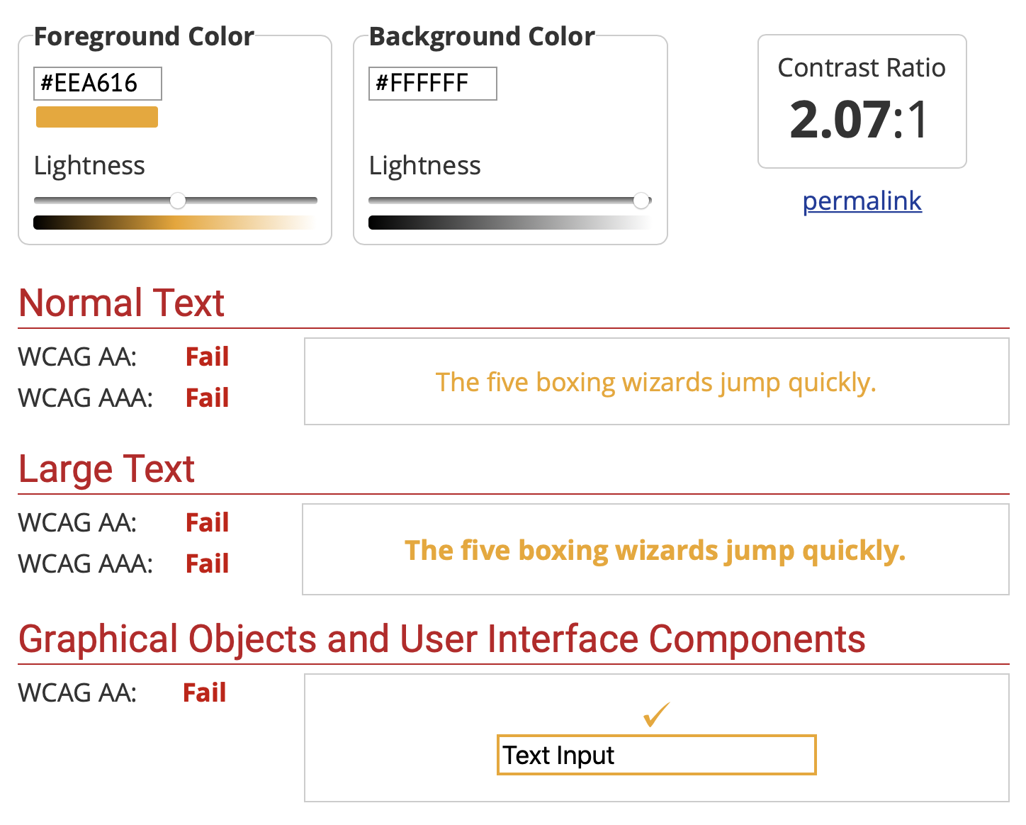
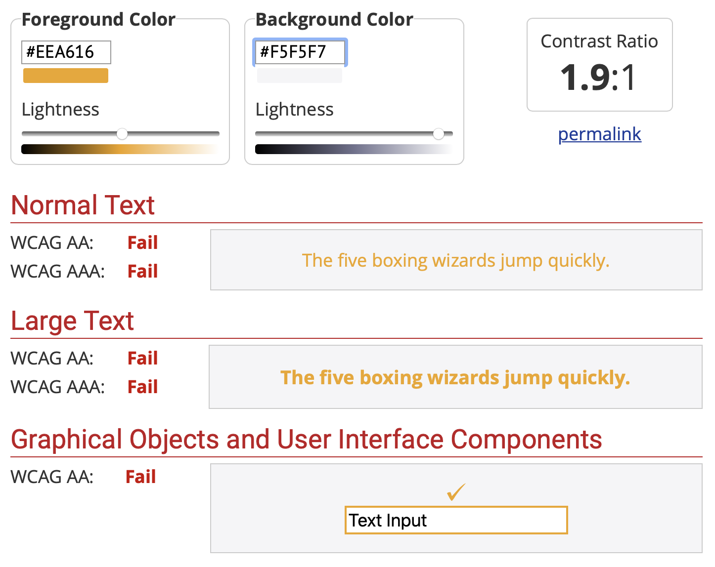
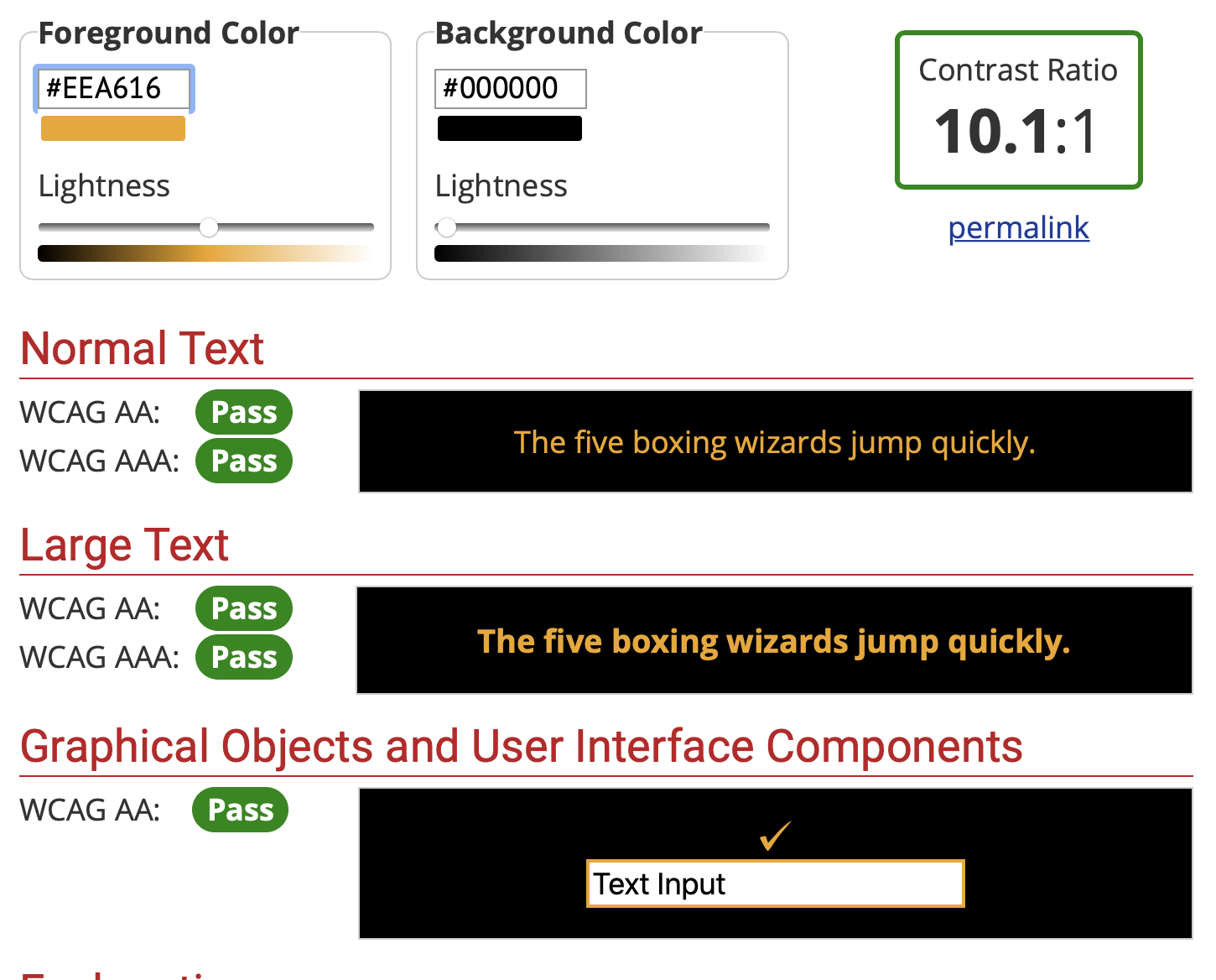
| Gold: #EEA616 | Epic fail |
OpenMRS Orange: #F26522
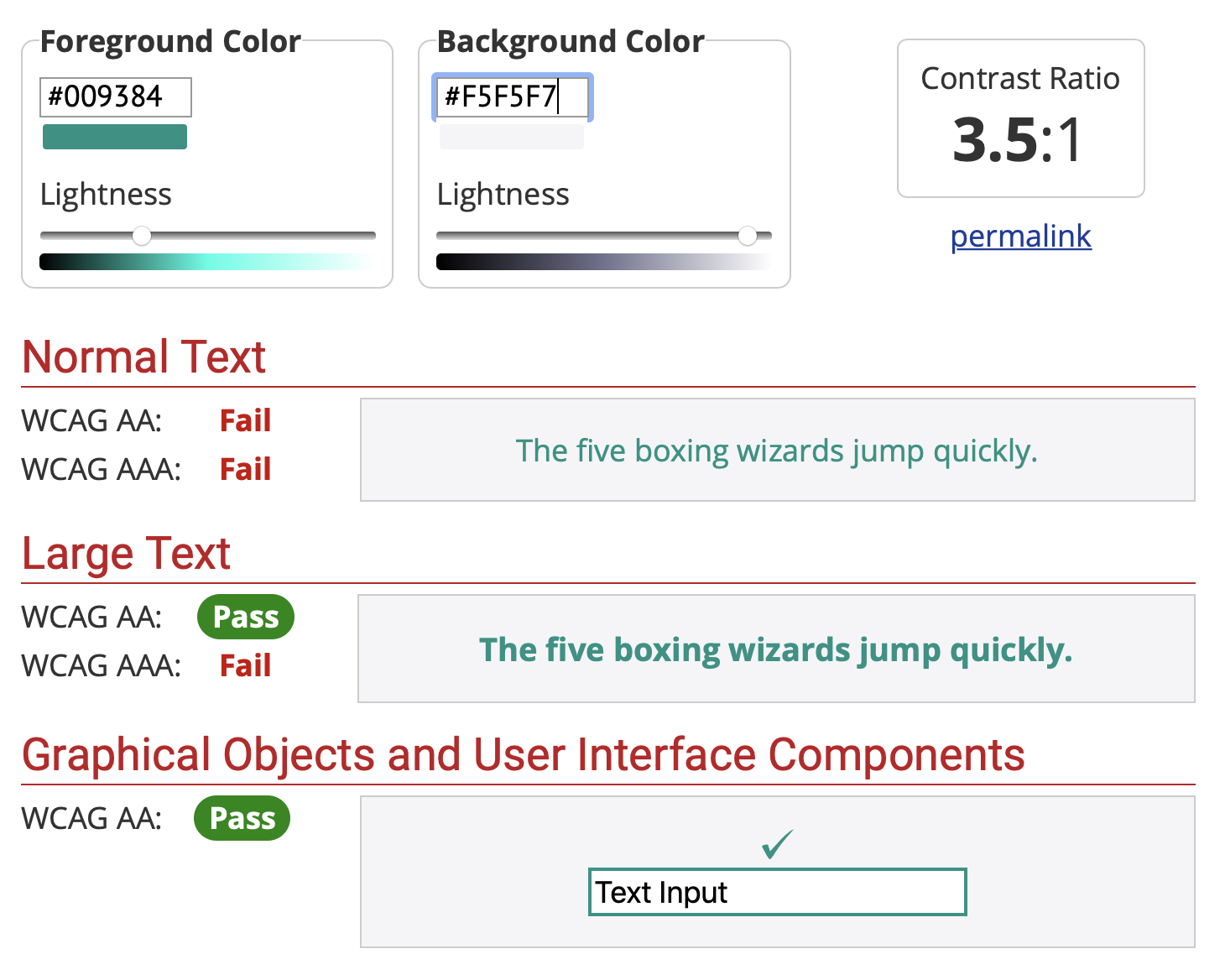
OpenMRS Teal #009384
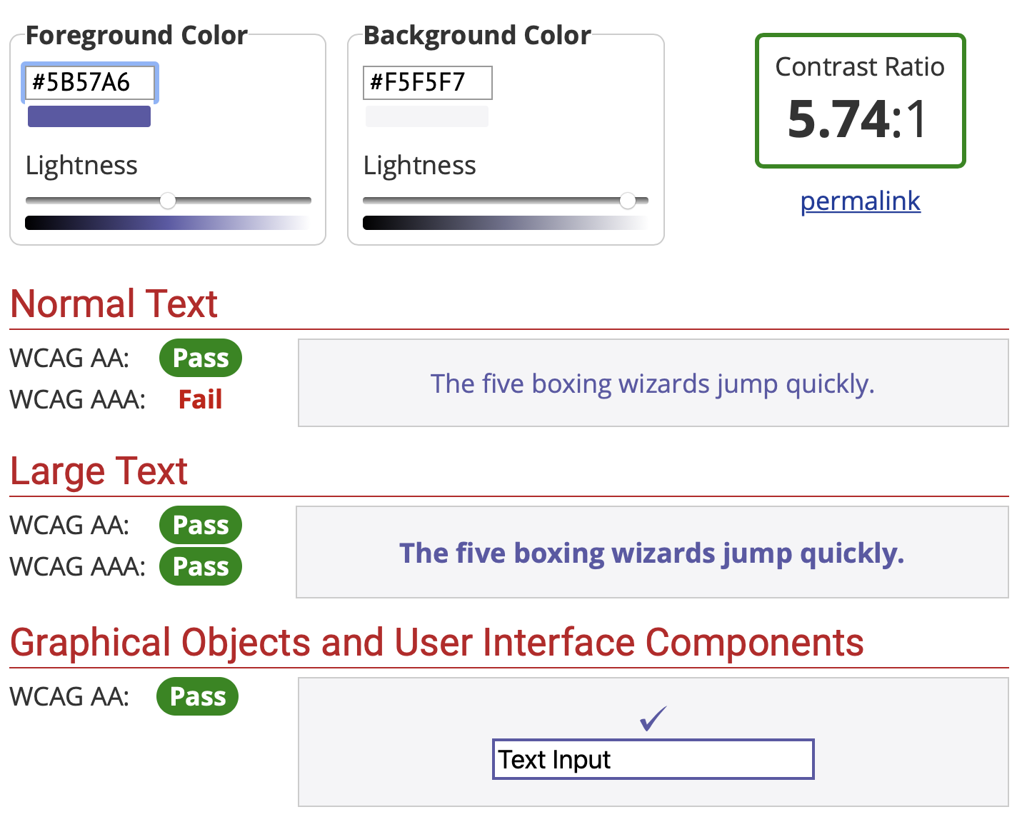
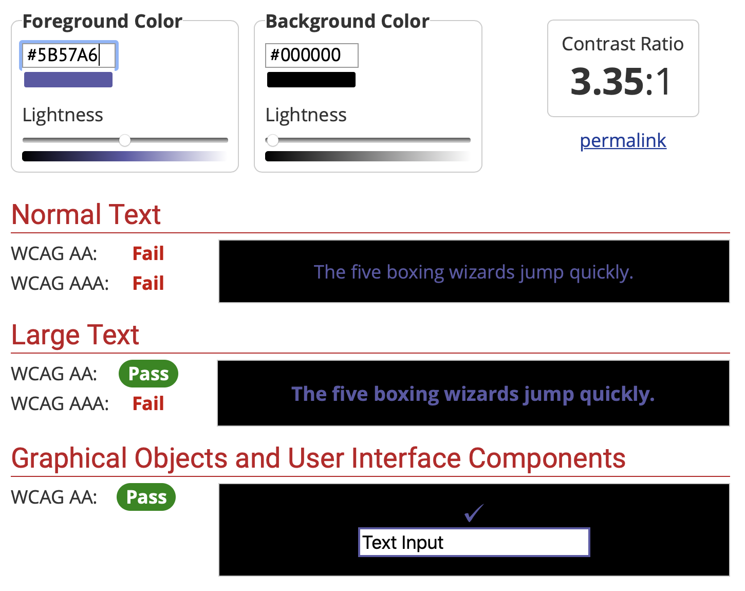
OpenMRS Violet: #5B57A6
OpenMRS Gold: #EEA616
Colors elsewhere on the internet - Color Study
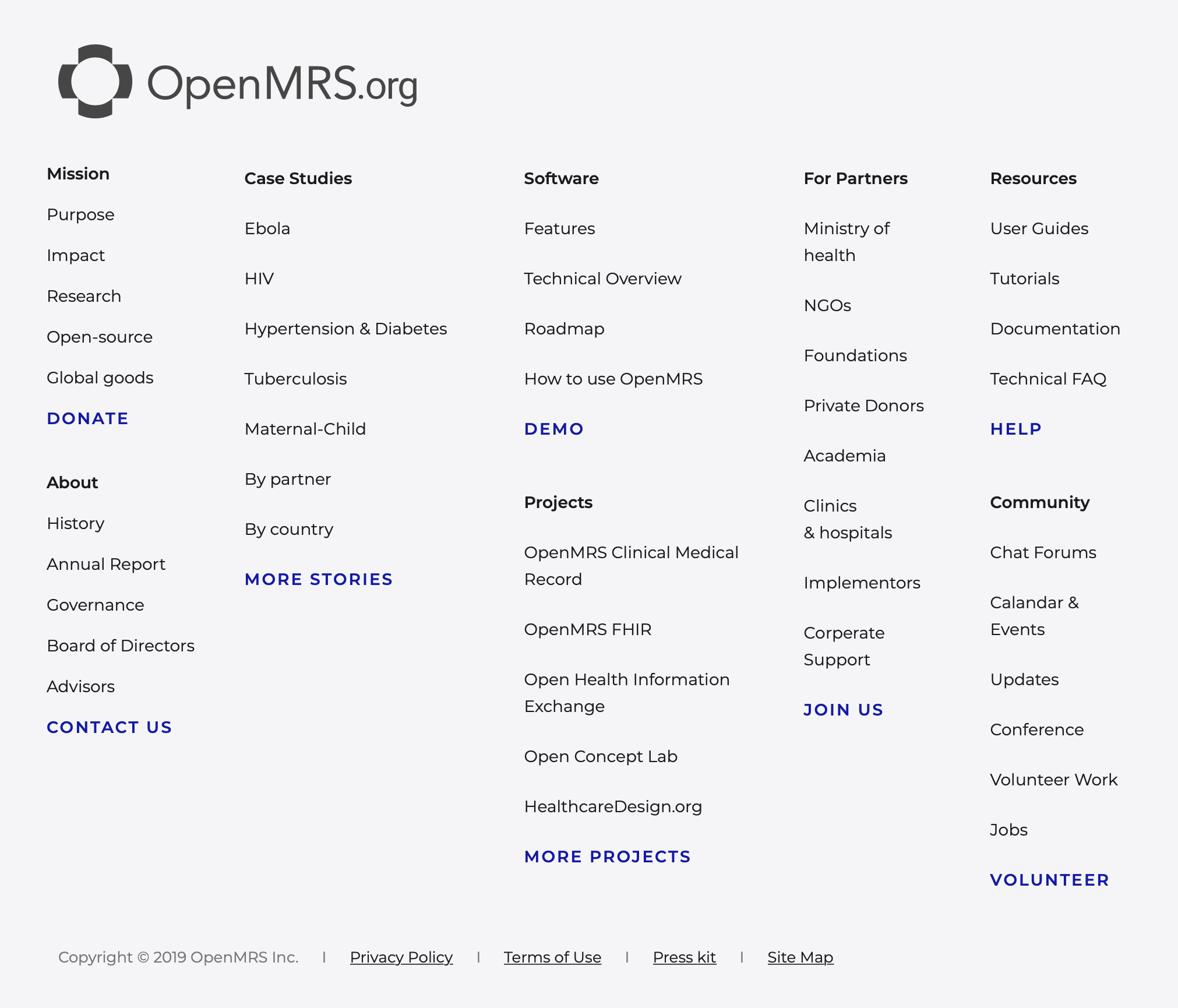
Google Links
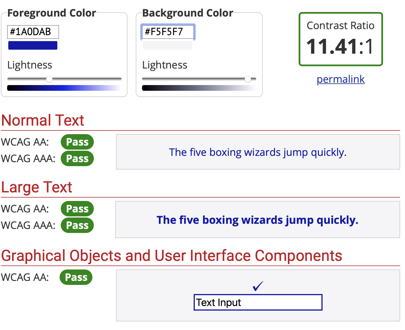
Google search results blue Dec 2019: #1a0dab
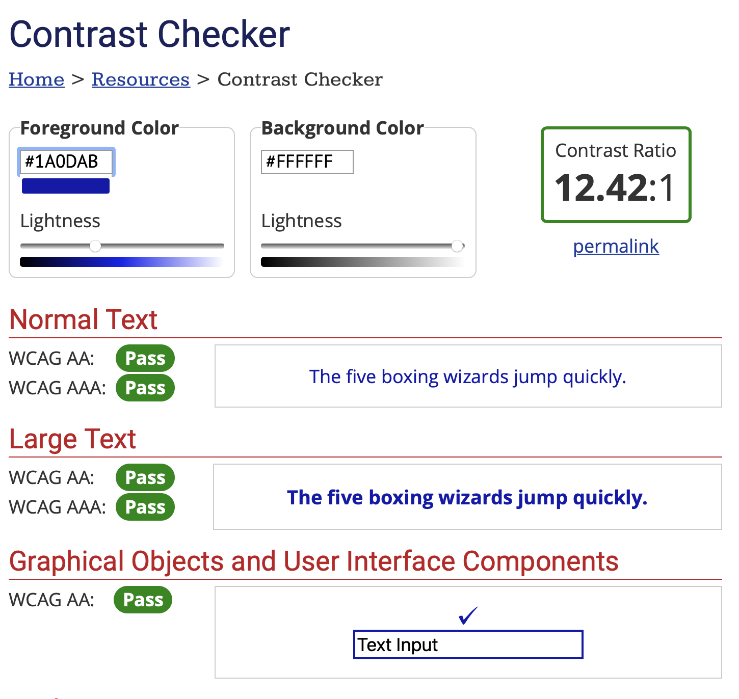
The darker link color was chosen over the lighter link color #2358C2
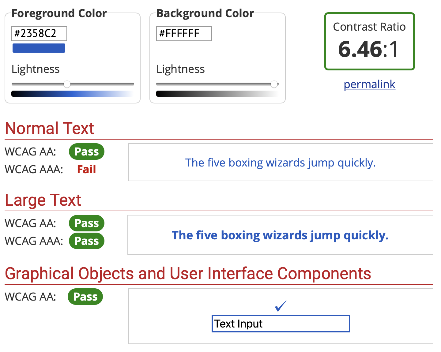
It is suspected the higher contrast may have been better
Traditional web action blue #33aaff
Real Life Examples
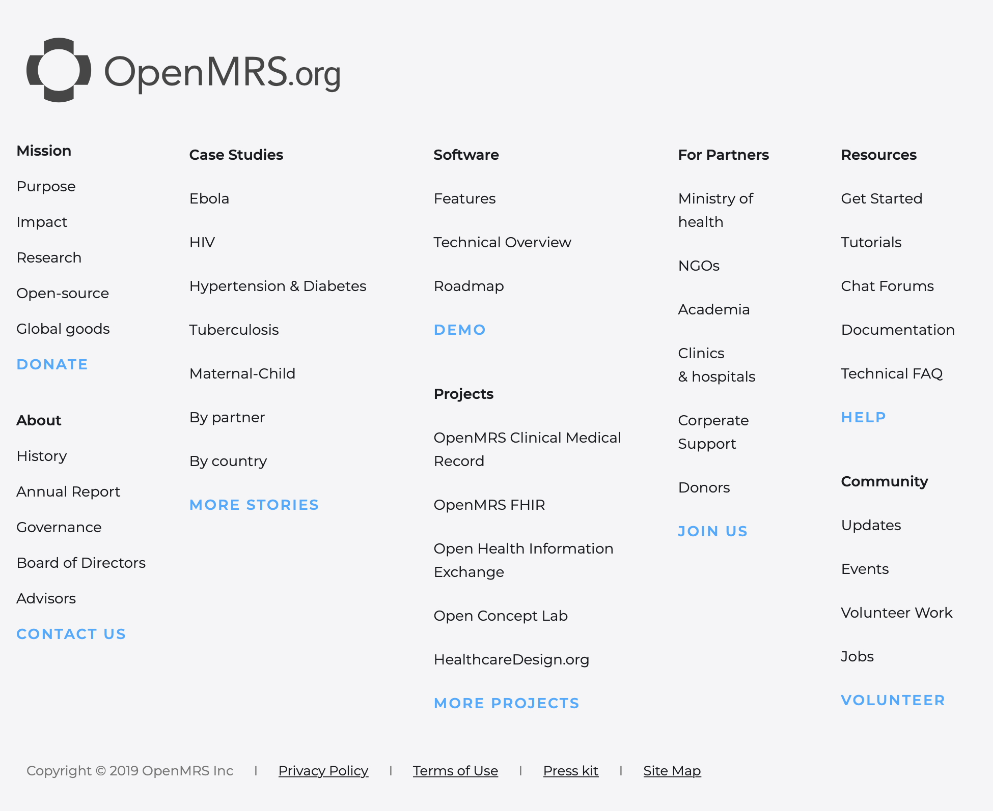
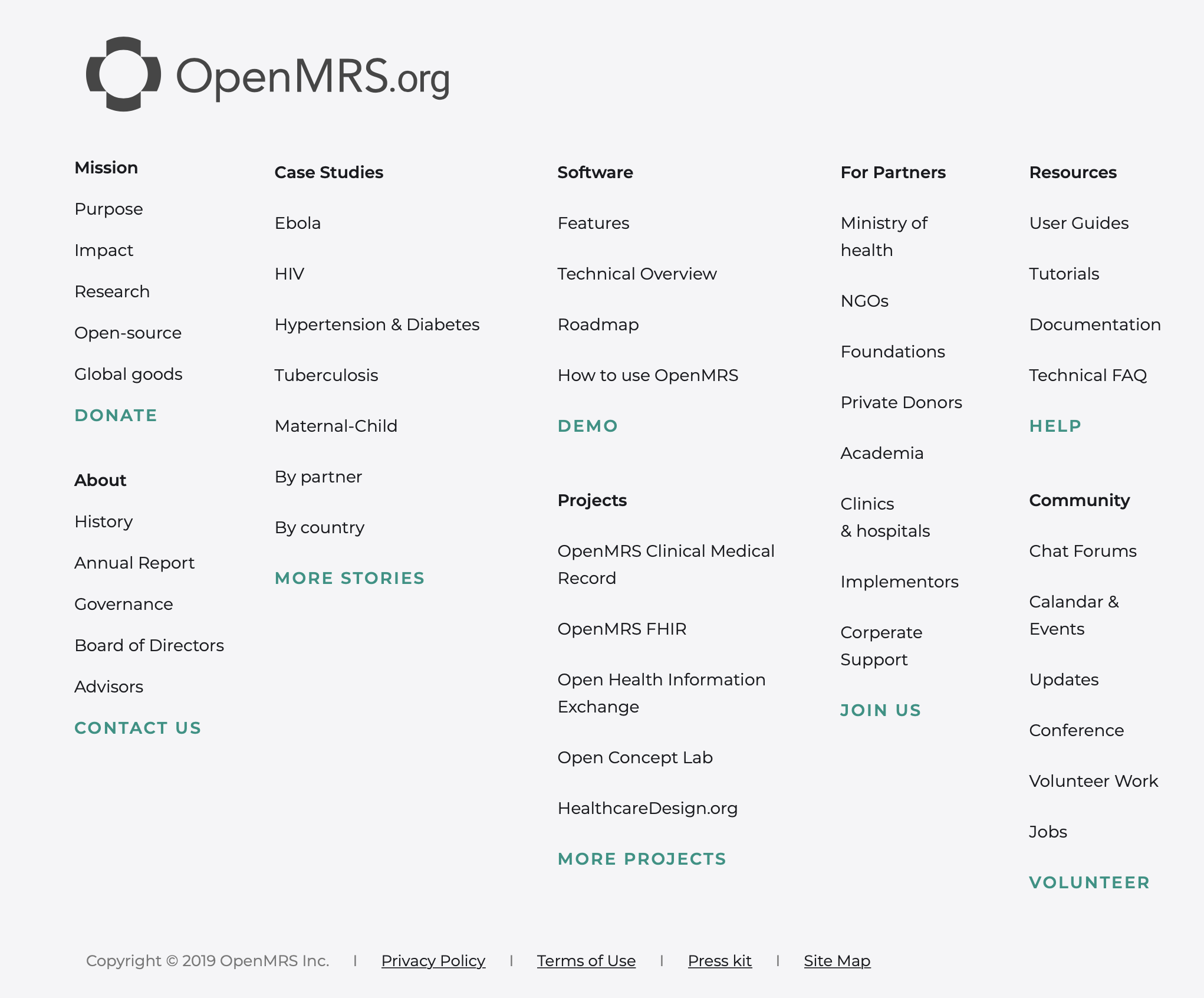
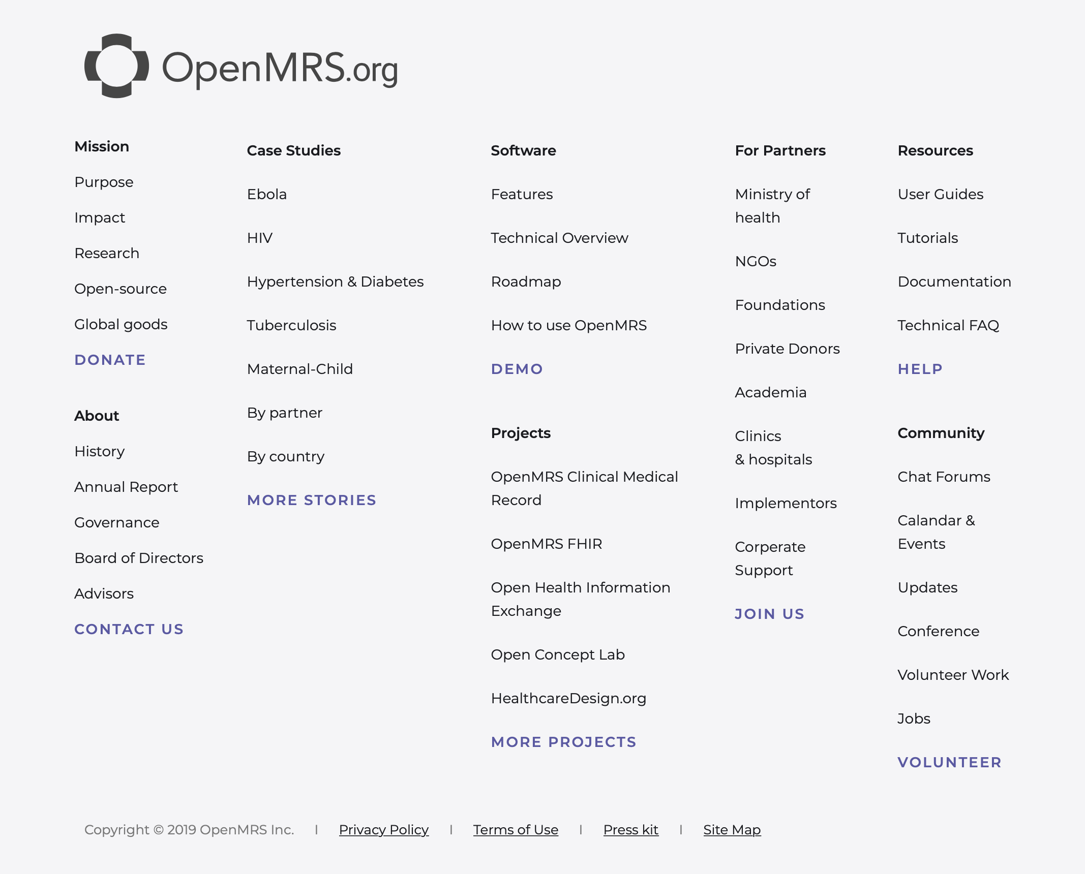
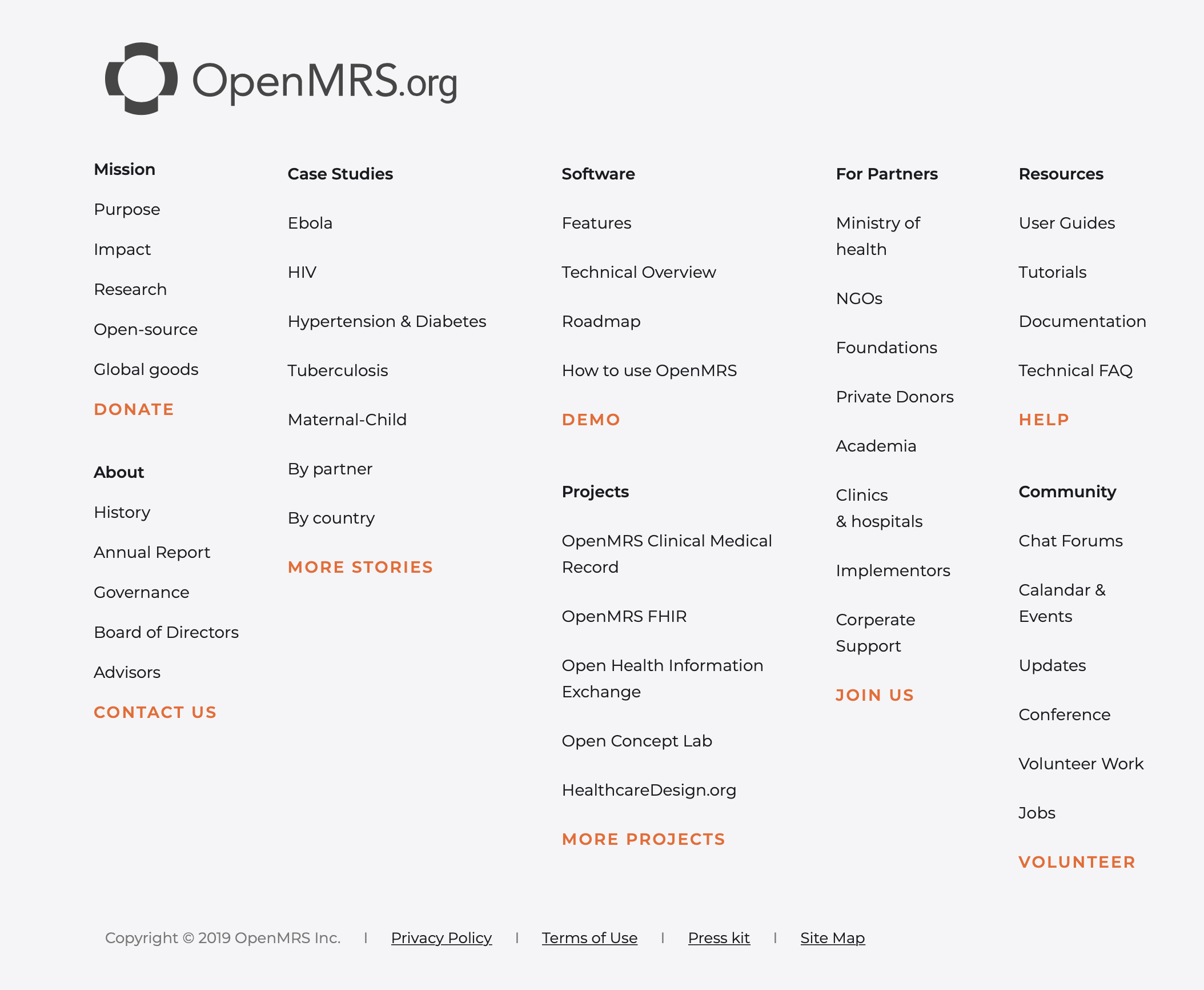
Website footer with very faint grey background (#f5f5f7)
OpenMRS Brand Colors
Google links colors (in dark and lighter shade)
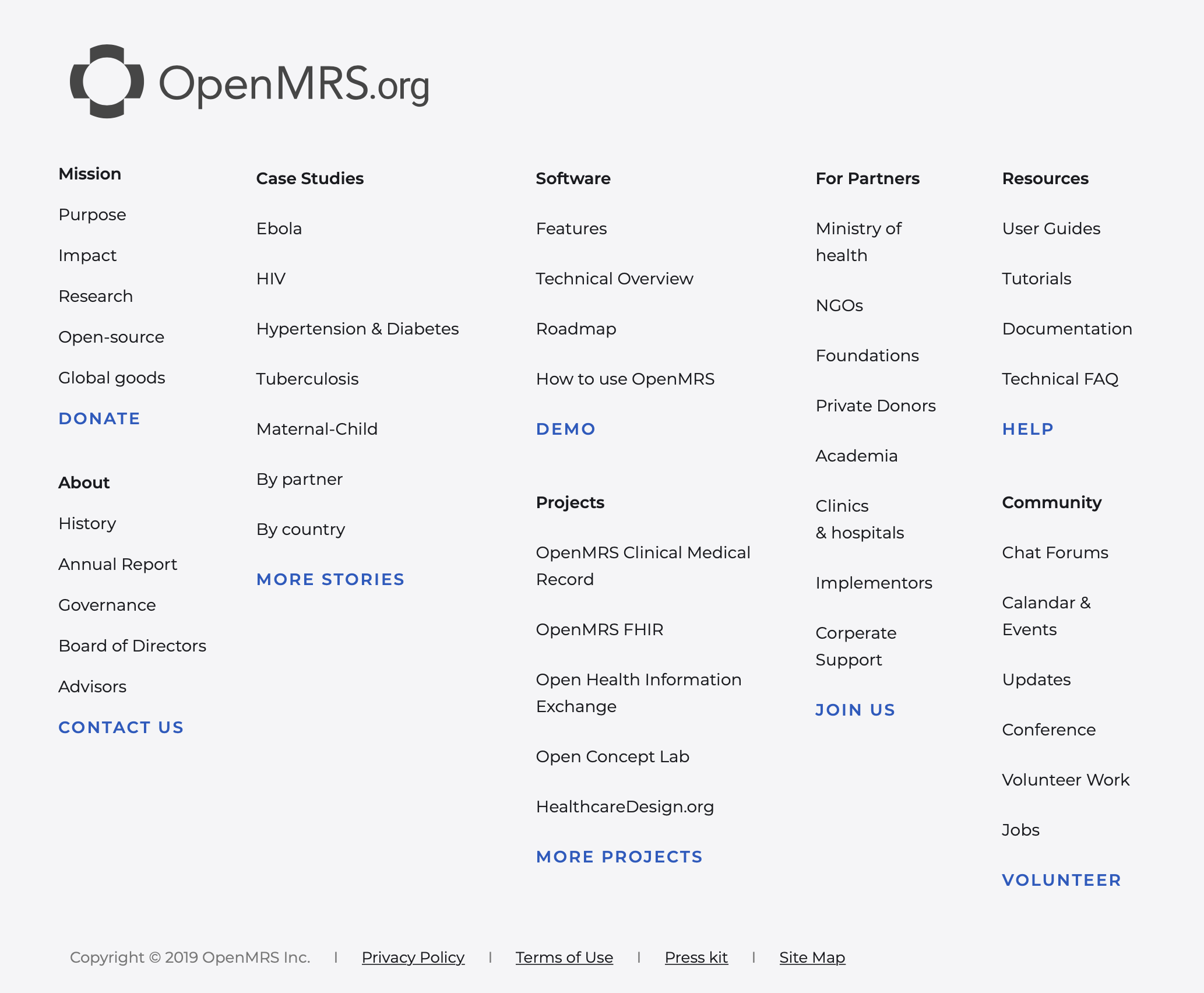
Apple links colors
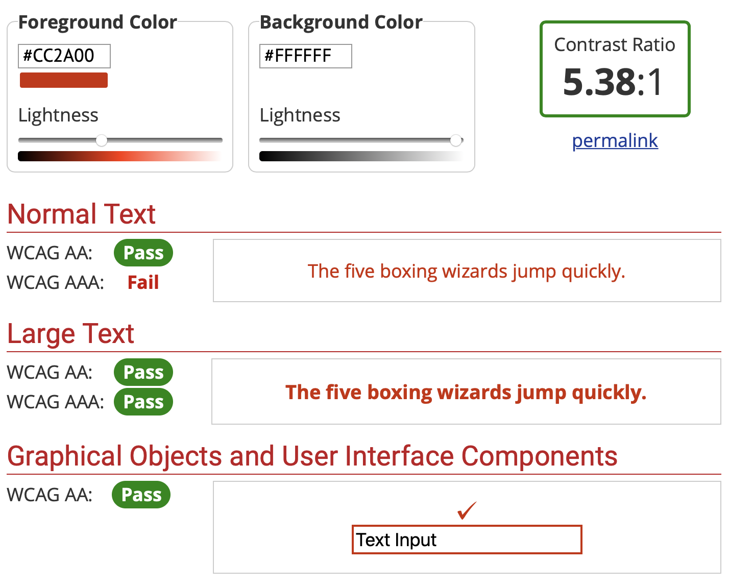
Experimenting with better options
Shift Orange to: #CC2A00
Shifting orange darker and closer to red increase the contrast, while being able to still have higher contrast with dark colors making primary action links stand out better.