HTML Form Entry Module Reference
Reference for writing HTML for the Html Form Entry Module
Tag Reference
<code>
See <translations>
<condition>
This tag lets you record a condition linked to the form's submitted encounter.
WARNING - This tag is supported from OpenMRS 2.3.3. The tag may work to a certain extent from Core 2.2.2 as some support for it was introduced too soon, however we strongly discourage this and suggest to upgrade Core appropriately.
Attributes
- required: this is used for validation, and if true the form will not be able to be submitted without the required condition otherwise the form would be submitted.
OPTIONAL
Value: "true" or "false"
Default: false
- controlId:
- REQUIRED
- Value: a unique string (within the form) to identify the condition control within the form.
- showAdditionalDetail: this toggles the visibility of the additional detail text box.
- OPTIONAL
Value: "true" or "false"
Default: false
Example Usage
<htmlform>
    ...stuff goes here...
	<!-- For cases were a condition is required -->
    <condition controlId="cond1" required="true"/>
	<!-- For cases were a condition is not required and additional detail is visible -->
    <condition controlId="cond2" showAdditionalDetail="true"/>
</htmlform>
<completeProgram>
Automatically completes a PatientProgram on the encounterDate when the form is submitted. This only happens if there is a valid PatientProgram for the patient on the encounterDate. If the program has outcomes configured, then if the same concept is used on the form, that concept will be the outcome of that patient's program.
An example usage would be for a transfer form, when a patient is being transferred permanently out of the district, or if you have finite programs like maybe for PMTCT, for example. The PMTCT program could have the outcome concept, "PMTCT Outcomes" assigned with concept set or coded answer members "Child Died", "Child HIV Positive", "Child HIV Negative". An observation with the coded answer "Child Died" on the form would activate the "Child Died" program outcome.
This is a complementary tag to the enrollInProgram tag. Available in htmlformentry 1.7.4.
Attributes
- programId: ID or UUID of the program, or name of the associated concept, in which the patient is to be enrolled.
- REQUIRED
- Examples:
- <completeProgram programId="1"/>
- <completeProgram programId="9b45541a-e8f0-41ff-a55a-445b08a8d8b5"/>
- <completeProgram programId="Rehab program"/>
- Value: Any valid program ID, program UUID or underlying concept name
- Default: None.
WARNING -- Changing the answer to the "outcome" observation will not change the outcome of the program.
<controls>
Conditionally displays a section of html content when an observation is set to a certain value. When a section is hidden, any inputs in it are cleared.
The <controls> tag is only allowed inside an
/> tag. It should contain one or more <when/> tags.
It will be triggered when the form is first loaded, as well as when the <obs> field changes value.
Available since 2.1.6.
Attributes
None
Example Usage
<obsgroup groupingConceptId="1">
    <p>
        Disposition:
        <obs id="whatKind" conceptId="2" answerConceptIds="3,4,5">
            <controls>
                <when value="3" thenDisplay="#admit-section"/>
                <when value="4" thenDisplay="#discharge-section"/>
            </controls>
        </obs>
    <p>
    <p id="admit-section">
        Admission diagnosis:
        <obs concept="100"/>
    </p>
    ...
</obsgroup>
<drugOrder>
NOTE - This tag is deprecated.
For htmlformentry versions < 4.0.0:
Documentation on the drugOrder tag for versions prior to 4.0.0 can be found at the bottom of this page, under "Legacy Version of Tags".
For htmlformentry versions >= 4.0.0:
In htmlformentry 4.0.0, the drugOrder tag was rewritten from the ground up as a more generic "order" tag. See the "order" tag section below for full documentation.
The "drugOrder" tag is simply a wrapper class that delegates to the order tag and allows for the "orderType" attribute to be excluded as long as their is only a single Order Type configured of class "org.openmrs.DrugOrder"
<encounterDate>
Data entry widget for recording encounter date. Along with encounterLocation and encounterProvider, encounterDate should be present on every HTML form.
Attributes
- default: Specifies default value for encounterDate widget.
- OPTIONAL
- Example: <encounterDate default="today"/>
- Value: "today", "now", or ?????
- Default: None
- showTime: The showTime attribute determines if the encounterDate widget is date-only or date and time.
- OPTIONAL
- Example: <encounterDate showTime="true"/>
- Value: "true" or "false"
- Default: False - Widget is date-only
- disallowMultipleEncountersOnDate: This will warn the user that this Form type has been entered for this Patient on this Encounter date. This will prevent duplicate paper entries of the same form. The mechanism for this is an ajax popup that is presented to the user after selecting an encounter date (only if there is already a form submitted of the same type for that date for that patient).
- OPTIONAL
- As of version 1.8.0
- Example: <encounterDate disallowMultipleEncountersOnDate ="warn"/>
- Value: "warn" or "block": 'warn' will only warn the user that they may be entering a duplicate form. 'block' will give the warning, and will then clear the encounterDate field, thus making the form un-submittable.
- Default: there is no default. You must choose one of the above.
- widget: preliminary support for having different widgets (in enter/edit mode).
- OPTIONAL
- As of version 2.5
- Example: <encounterDate widget="hidden"/>
- Value: "hidden" (or no value)
- (no value): Standard widgets (jQuery UI datepicker, optional dropdowns for hour, minute, second)
- hidden: In enter/edit mode, there will be no visible widgets, but just <input type="hidden" .../> (one for date, and optionally 3 for hour, minute, second); This is for the advanced use case where you want to provide custom widgets that will set the values of the hidden inputs via javascript.
- Default: none standard widgets
Example Usage
<encounterDate/>                   <!-- an initially-blank date widget -->
<encounterDate default="today"/>   <!-- a date widget pre-filled with today's date -->
<encounterDate showTime="true"/>   <!-- a date and time widget -->
<encounterDate showTime="true" default="now"/>   <!-- a date and time widget defaulting to the time on the server -->
<encounterDiagnoses> & <encounterDiagnosesByObs>
Data entry widgets bundled within the Core Apps module (and not HTML Form Entry) for recording encounter diagnoses with auto-completion. It can record multiple diagnoses marking them as presumed/confirmed and/or primary/secondary. Either of <encounterDiagnoses> or <encounterDiagnosesByObs> tag can be used at-most once in an HTML form.
Attributes
- required: Specifies that the diagnoses field must be completed/filled.
- OPTIONAL
- Example:
<encounterDiagnoses required="true"/> - Value: "true", "false"
- Default: false
- selectedDiagnosesTarget: Specifies the id of the
<div>container where the selected diagnoses are displayed.- REQUIRED
- Example:
<encounterDiagnoses selectedDiagnosesTarget="encounter-diagnoses-target"/><div id="encounter-diagnoses-target"></div> - Value: can be any valid HTML safe id
- Default: There is no default for this and therefore should be provided as illustrated in the above example.
- preferredCodingSource: This is used to notify the user that choices that are presented to him through the autocomplete don't pertain to a preferred source.
- OPTIONAL
- As of version Core Apps 1.23.0
- Example:
<encounterDiagnoses preferredCodingSource="ICD-10-WHO"/> - Value: A valid concept source name, e.g "ICD-10-WHO", "CIEL", "ICPC2", ... etc.
- Default: "ICD-10-WHO"
- diagnosisConceptClasses: Specifies one or more concept classes in a form of a comma separated string to search in. Can be used together with diagnosisConceptSources.
- OPTIONAL
- As of version 1.23.0
- Examples:
<encounterDiagnoses diagnosisConceptClasses="Diagnosis"/><encounterDiagnoses diagnosisConceptClasses="Diagnosis,Finding"/> - Value: A valid concept class e.g "Diagnosis", list of classes "Diagnosis,Finding"
- diagnosisConceptSources: Specifies one or more concept sources in a form of a comma separated string to search in. Can be used together and works well with diagnosisConceptClasses.
- OPTIONAL
- As of version 1.23.0
- Examples:
<encounterDiagnoses diagnosisConceptSources="CIEL"/><encounterDiagnoses diagnosisConceptSources="CIEL,ICPC2"/><encounterDiagnoses diagnosisConceptSources="0"/>NOTE: pointing to a null concept source ensures that no default will be used, it will remove the concept sources as a space for the search.<encounterDiagnoses diagnosisConceptSources=""/>NOTE: pointing to an empty concept source will lead to using the defaults. - Value: A valid concept sources e.g "ICD-10-WHO", list of sources "CIEL,ICPC2" or "0" (zero)
- Default: "ICD-10-WHO"
- diagnosisSets: Specifies the concept sets of diagnoses to search from. Can be one or more comma separated string of UUIDs, concept mappings (e.g CIEL:160170) or combination of both representing the sets. This when provided, overrides the default globally configured set of sets of diagnoses to search from.
- OPTIONAL
- As of version 1.23.0
- Examples:
<encounterDiagnoses diagnosisSets="160170AAAAAAAAAAAAAAAAAAAAAAAAAAAAAA,160169AAAAAAAAAAAAAAAAAAAAAAAAAAAAAA"/><encounterDiagnoses diagnosisSets="CIEL:160170,CIEL:160169"/><encounterDiagnoses diagnosisSets="CIEL:160170,160170AAAAAAAAAAAAAAAAAAAAAAAAAAAAAA"/><encounterDiagnoses diagnosisSets="0"/>
NOTE: pointing to a null concept set ensures that no default will be used, it will remove the concept sets as a space for the search.<encounterDiagnoses diagnosisSets=""/>
NOTE: pointing to a empty concept set will lead to using the defaults. - Value: comma separated string of UUID or Concept Mappings or both or "0". When "0" (zero) is used, this means that the default globally defined concept sets are not used to search in.
- Default: concepts contained in the sets globally defined by a set of sets concept (CIEL:160167 or 160167AAAAAAAAAAAAAAAAAAAAAAAAAAAAAA).
- IMPORTANT NOTE: When the
diagnosisSetsis specified either through global defaults or provided in this HFE tag, the name search for diagnoses within classes and/or sources is bypassed. This means that the name search only operates within those sets, such that the classes and/or sources are ignored. To globally define diagnosis concepts sets and/or diagnosis concept sources, edit the emr.concept.diagnosisSetOfSets and emrapi.conceptSourcesForDiagnosisSearch global properties respectively.
Example Usages
The following examples are identical to using the <encounterDiagnosesByObs/> tag.
<encounterDiagnoses required="true" selectedDiagnosesTarget="#encounter-diagnoses-target" preferredCodingSource="ICD-10-WHO"/>

<encounterDiagnoses required="true" selectedDiagnosesTarget="#encounter-diagnoses-target" preferredCodingSource="ICD-10-WHO" diagnosisConceptSources="ICD-10-WHO"/>

<encounterDiagnoses required="true" selectedDiagnosesTarget="#encounter-diagnoses-target" preferredCodingSource="ICD-10-WHO" diagnosisConceptClasses="Diagnosis"/>

<encounterDiagnoses required="true" selectedDiagnosesTarget="#encounter-diagnoses-target" preferredCodingSource="ICD-10-WHO" diagnosisConceptClasses="Diagnosis" diagnosisConceptSources="0"/>

<encounterDiagnoses required="true" selectedDiagnosesTarget="#encounter-diagnoses-target" preferredCodingSource="ICD-10-WHO" diagnosisSets="CIEL:160170,CIEL:160169"/>

<encounterDiagnoses required="true" selectedDiagnosesTarget="#encounter-diagnoses-target" preferredCodingSource="ICD-10-WHO" diagnosisSets="CIEL:160170,CIEL:160169"/>

<encounterDiagnoses required="true" selectedDiagnosesTarget="#encounter-diagnoses-target" preferredCodingSource="ICD-10-WHO" diagnosisSets="160170AAAAAAAAAAAAAAAAAAAAAAAAAAAAAA,160169AAAAAAAAAAAAAAAAAAAAAAAAAAAAAA"/>
<encounterLocation>
Data entry widget for recording location of the encounter. Along with encounterDate and encounterProvider, encounterLocation should be present on every HTML form.
Attributes
- default: Sets default value for the widget.
- OPTIONAL
- Example: <encounterLocation default="2"/>
- Example: <encounterLocation default="SessionAttribute:emrContext.sessionLocationId"/>
- Example: <encounterLocation default="SystemDefault"/>
- Value: Location ID, Location UUID, Location Name. Since 1.9.5 we also support "GlobalProperty:xyz" and "UserProperty:xyz" where xyz is the name of a global property or user property, whose value must be equal to a legal location value using one of the supported formats. Since 2.0.3 we also support "SessionAttribute:xyz" where xyz is the name of an HttpSession attribute, whose value must be a location, or a String using one of the supported formats. Since 2.3 we support "SystemDefault" to set the default to the configured system default.
- Default: None
- order: Determines which locations appear in the list, and specifies the order in which they appear.
- OPTIONAL
- Example: <encounterLocation order="2,7,4"/>
- Value: Comma separated list of Location IDs, Location UUIDs, or Location Names
- Default: All non-retired locations in alphabetical order
- tags: Limits the locations that appear in the list to locations tags with one or more the specified tags
- Since 2.1.3
- OPTIONAL
- Example: <encounterLocation tags="Admission Location, 1" />
- Value: Comma separated list of Location Tags IDs or Location tag Names
- Cannot be used in conjunction with the order attribute
- required: Defaults to true when not specified. When false the form can be submitted without specifying a location
- restrictToCurrentVisitLocation: when set to true and in a context of a visit, restricts the list of locations to the visit location and children/grandchildren/etc of that location
- Since 4.0.0
- OPTIONAL
- Example: <encounterLocation restrictToCurrentVisitLocation="true"/>
- Value: true/false
- Default: false
- Can be used with the order or tags attribute... "tags" or "order" will be used to get the base list of potential locations, and then that list will be filtered by the criteria described above
- Can be globally enabled by setting a the global property "htmlformentry.restrictEncounterLocationToCurrentVisitLocation" to "true"
- restrictToSupportedVisitLocations: when set to true, restricts the list of locations to those tagged as "Visit Locations" and their children
- Since 3.12.0
- OPTIONAL
- Example: <encounterLocation restrictToSupportedVisitLocations="true"/>
- Value: true/false
- Default: false
- Cannot be used in conjunction with the order or tags attribute
- type: Specifies the input element to display (i.e a dropdown vs autocomplete); shows a dropdown by default if type is not specified
- Since 1.11
- OPTIONAL
- Example: <encounterLocation type="autocomplete"/>
- Value: "autocomplete"
- Default: dropdown
Example Usage
<encounterLocation/>                                    <!-- a list of all locations, sorted alphabetically by name -->
<encounterLocation default="2"/>                        <!-- a list of all locations, sorted alphabetically by name, with location 2 selected by default -->
<encounterLocation default="GlobalProperty:defLoc"/>    <!-- a list of all locations, sorted alphabetically by name, with the location specified in the "defLoc" global property selected by default -->
<encounterLocation default="SessionAttribute:emrContext.sessionLocationId"/> <!-- uses the currently logged in location, per the Reference App -->
<encounterLocation order="2,7,4"/>                      <!-- a list of the specified locations, by id -->
<encounterLocation order="Rwinkwavu,Kirehe,Mulindi"/>   <!-- a list of the specified locations, by name -->
<encounterLocation type="autocomplete"/>                <!-- an autocomplete field for location selection, with prepopulated list of locations -->
<encounterProvider>
Data entry widget for recording provider for the encounter. Along with encounterDate and encounterLocation, encounterProvider should be present on every HTML form. (In 1.9+ you should use the <encounterProviderAndRole> tag instead.)
Attributes
- default: Sets default value for the widget.
- OPTIONAL
- Example: <encounterProvider default="djaz"/>
- Value: username, currentUser, Person IDs, or Person UUID
- Default: None
- role: Filters the list of persons to only those users with the specified role
- OPTIONAL
- Example: <encounterProvider role="Provider"/>
- Value: Any valid role
- Default: Provider
- persons: Determines which persons appear in the list, and specifies the order in which they appear.
- OPTIONAL
- As of version 1.6.8
- Example: <encounterLocation persons="1,2,4"/>
- Value: Comma separated list of usernames, Person IDs, or Person UUIDs
- required: Defaults to true when not specified. When false the form can be submitted without specifying a provider
- type: Specifies the input element to display (i.e a dropdown vs autocomplete); shows a dropdown by default if type is not specified
- Since 1.11
- OPTIONAL
- Example: <encounterProvider type="autocomplete"/>
- Value: "autocomplete"
- Default: dropdown
Example Usage
<encounterProvider/>                       <!-- a list of all users -->
<encounterProvider default="djaz"/>        <!-- a list of all users, with the user whose username is djaz selected -->
<encounterProvider default="6"/>           <!-- a list of all users, with the user whose userId is 6 selected -->
<encounterProvider default="currentUser"/> <!-- a list of all users, with the current user selected -->
<encounterProvider role="Provider"/>       <!-- a list of those users with the Provider role -->
<encounterProvider persons="username1,username2"/>   <!-- a list of those 2 Persons who are users with usernames username1 and username2 -->
<encounterProvider type="autocomplete"/>             <!-- an autocomplete field for provider selection, with pre populated list of providers-->
<encounterProviderAndRole>
(since 1.9; requires htmlformentry19ext module)
Data entry widget for recording one or more providers for the encounter, along with the roles those providers played in the encounter.
Note that "provider roles" and "encounter roles" are different things. Providers have provider roles, e.g. "Yemi is a surgeon." A provider may have an encounter role within an encounter, e.g. "Yemi was the lead surgeon for this encounter."
If the encounterRole attribute is not provided, the widget renders as a pair of dropdowns. The first allows selecting from a list of providers; the second allows selecting from a list of encounter roles. If the encounterRole attribute is provided, the encounter role dropdown is omitted.
Note that this tag cannot be repeated in the usual fashion; see the "Note" below. Instead, use the count and providerWidgetSeparator attributes.
Attributes
All attributes are optional
- default: Sets default provider for the widget (id or uuid of a Provider, or "currentUser").
- If you specify "currentUser" but the currently-logged-in user does not have a Provider record associated with their Person record, nothing happens. (If that user has more than one Provider record, one is chosen arbitrarily.)
- encounterRole: Use the given
encounterRoleinstead of rendering a dropdown.- If the
encounterRoleattribute is not provided, the widget renders as a pair of dropdowns. The first allows selecting from a list of providers; the second allows selecting from a list of encounter roles. If theencounterRoleattribute is provided, the encounter role dropdown is omitted; the provider is added to the encounter with the encounter role given as the value of this attribute. - Value: id or uuid of an encounterRole
- If the
- providerRoles: Limit the list of possible providers to those with any of the specified
providerRoles- Example: <encounterProviderAndRole providerRoles="8" />
- Value: Comma separated list of provider role id or uuid
- Requires that the Provider Management module be installed
- since HFE 1.9 Extensions 1.2
- required: when true, the form cannot be submitted unless you have chosen a provider
- autocompleteProvider: When true, the provider widget is rendered in autocomplete search box in which user is expected to type the few characters used to search for a particular provider (s).
- Value: true or false
- Default: false
- Example: <encounterProviderAndRole autocompleteProvider="true"/>
- since HFE 1.9 Extensions 1.6
- providerMatchMode: Used in conjunction with autocompleteProvider attribute to specify the position to match search text in provider identifier/names.
- Values: START, END, ANYWHERE (Default is START)
- Example: <encounterProviderAndRole autocompleteProvider="true" providerMatchMode="ANYWHERE" />
- Since HFE 1.9 Extensions 1.6
- count: Repeat this widget
counttimes. See the "Note" below.- Default: 1
- providerWidgetSeparator: If using
count, this HTML is inserted in between each widget.- Default: ", "
- Since: htmlformentry version 3.10.0
Example:
<div class="provider-grid"> <div> <encounterProviderAndRole encounterRole="98bf2792-3f0a-4388-81bb-c78b29c0df92" count="2" providerWidgetSeparator="</div><div>"/> </div> </div>
Example Usage
<encounterProviderAndRole/>                                   <!-- dropdown of encounter roles : dropdown of providers -->
<encounterProviderAndRole default="currentUser"/>             <!-- dropdown of encounter roles : dropdown of providers with one chosen by default -->
<encounterProviderAndRole encounterRole="1" required="true"/> <!-- dropdown of providers, required for submission -->
<encounterProviderAndRole encounterRole="2" default="3"/>     <!-- dropdown of providers, with one chosen by default -->

<encounterProviderAndRole encounterRole="2" count="2"/>       <!-- display 2 dropdown of providers, for encounter role 2 -->
<encounterProviderAndRole autocompleteProvider="true" encounterRole="1" /> <!--display an autocomplete search box for provider-->
Notes
Currently, only one encounterProviderAndRole tag is is supported per encounter role, and only a single tag without a encounterRole is supported. For instance, the following two examples below would be illegal:
<!-- can't have two tags without specifying a role -->
First Provider: <encounterProviderAndRole/>
Second Provider: <encounterProviderAndRole/>

<!-- can't have two tags with the same provider role -->
First Doctor: <encounterProviderAndRole encounterRole="2" />
Second Doctor: <encounterProviderAndRole encounterRole="2"/>
First Nurse: <encounterProviderAndRole encounterRole="3" />
Second Nurser: <encounterProviderAndRole encounterRole="3"/>

<!-- proper way to specific multiple providers of different roles -->
Doctors: <encounterProviderAndRole encounterRole="2" count="2"/>   <!-- renders two dropdowns for providers -->
Nurses: <encounterProviderAndRole encounterRole="3" count="2"/>
<encounterType>
Used to specify the Encounter Type while filling out an HTML Form rather than when designing the form. When using this tag, the "Encounter Type" field of the HTML Form design should be left blank.
Attributes
- types: comma-separated list of encounterTypes to display in the select list, referenced by id, uuid, or name
- default: the default encounterType, referenced by id, uuid or name
Example Usage
<encounterType types="25,24,9,23,20,14,18,22,19,13,10,17,26,11,12,16,21,15,27" default="CLINIC MOBILE" />
<encounterVoided>
In edit mode only, for an existing encounter, renders a voided checkbox that allows you to void the encounter. There are no tag arguments. Available in htmlformentry1.7.4. This tag does not render anything when entering a new form, or when viewing an existing encounter (viewing the encounter implies already implies that the encounter is not voided).
Example Usage
<encounterVoided/>
<enrollInProgram>
Enrolls a patient in a program when the form is submitted.
To automatically un-enroll a patient, see the completeProgram tag.
Specifics about this enrollment behavior:
- If the patient is already in the program on the selected date, nothing changes
- If the patient is registered in the program after the selected date, then the patient's enrollment date will be moved back to the selected date, otherwise, patient is enrolled on selected date
- Otherwise, the patient is enrolled as requested
- If state ids are specified, these patient states are set upon program enrollment
- If the patient is already enrolled in the program when this form is submitted, the patient states are NOT automatically set; however, if the enrollment date is changed (via the logic above) all the states that have a start date equal to the enrollment date are changed to the new enrollment date
- This tag is invalid if any of the states listed are not initial states, or if two or more of the states are from the same workflow
- If the showDate parameter is not used, the encounterDate tag must appear above the enrollInProgram tag. See Error rendering macro 'jira' : Unable to locate Jira server for this macro. It may be due to Application Link configuration.
Attributes
- locationTag: if specified, the enrollment location of the patient program is set to the encounter location if the encounter location is tagged with the specified tag; otherwise it searches up through the parent locations of the location and uses the first location found with that tag. If no matching location found with that tag, enrollment location is not set. Note that this only sets the location on initial enrollment, it does not edit the enrollment location if the encounter location is later edited. Also, note that if this tag is not present, no enrollment location is set (which was default behavior before introduction of this tag).
- OPTIONAL
- Example:
- <enrollInProgram programId="Rehab program" locationTag="Program Location"/>
- Since version 3.12.0
- programId: ID or UUID of the program, or name of the associated concept, in which the patient is to be enrolled.
- REQUIRED
- Examples:
- <enrollInProgram programId="1"/>
- <enrollInProgram programId="9b45541a-e8f0-41ff-a55a-445b08a8d8b5"/>
- <enrollInProgram programId="Rehab program"/>
- Value: Any valid program ID, program UUID or underlying concept name
- Default: None
- showDate: If true, a date widget is displayed and the patient is enrolled on the selected date; if false, or if no date selected, the patient is enrolled on the encounter date
- OPTIONAL
- Example: <enrollInProgram programId="1" showDate="true"/>
- Value: true or false
- Default: False
- showCheckbox: If true, a checkbox widget is displayed. The patient is only enrolled if the box is checked. If the patient is already enrolled, the box is checked and disabled – it cannot be used to un-enroll a patient. Whether or not the patient is enrolled is based on the existing encounter date if there is one, else the default encounter date, else today.
- OPTIONAL
- Example: <enrollInProgram programId="1" showCheckbox="true"/>
- Value: true or false
- Default: False
- Since version 3.9.0
- toggle: If showCheckbox is enabled, specifies the ID of a DOM element to hide or dim when the checkbox is unticked.
- OPTIONAL
- showCheckbox must be "true"
- The toggle attribute accepts two syntaxes:
Basic: The basic syntax simply accepts the ID of the DOM element. It hides the element when the checkbox is not ticked.
<enrollInProgram id="ANC" showCheckbox="true" toggle="anc-form"/>

<div id="anc-form">
   Favorite baby name
   <obs conceptId="101" style="textarea"/>
</div>
Advanced: The more advanced syntax accepts a JSON structure with the attributes "id" and "style". The "id" attribute is the ID of the DOM element that you wish to hide or disable. The "style" attribute accepts either "hide" (default) or "dim". The "hide" style completely hides the target element until the checkbox is checked. The "dim" style greys-out and disables the child components of the target element until the checkbox is checked.
<enrollInProgram id="ANC" showCheckbox="true" toggle="{ id: 'anc-form', style: 'dim' }"/>

<div id="anc-form">
   Fetal hair color
   <obs conceptId="102" style="textarea"/>
</div>
- Since version 3.9.0
- stateIds: A comma-separated list of program work flow states ids
- OPTIONAL
- Example: <enrollInProgram programId="1" stateIds="3, 444ce6ba-551d-11e1-8cb6-00248140a5eb, PIH:356789"/>
- Value: Any valid program workflow state id, program workflow state uuid, or concept mapping of the underlying concept for the state
- Default: None
- If you reference states by concept mappings, be careful that you don't have two states in the same program with the same underlying concept, or unpredictable results will occur!
<excludeIf>
A tag that optionally exclude all its content based on evaluating a logic token or a velocity expression. This tag has to only contain either a logic test or a velocity test.
NOTE: logicTest is not available in htmlformentry version 4.0.0+
Attributes
- logicTestA logic expression represents a logic test.
- OPTIONAL
- Example: <excludeIf logicTest="GENDER = F"/> - A logic test to see if the patient's gender is female
- velocityTestA velocity expression represents a velocity test.
- OPTIONAL
- Example: <excludeIf velocityTest="$patient.gender == 'F' "/> - A velocity test to see if the patient's gender is female.
Example Usage
<htmlform>
     <table border="0" width="100%">
        <tr><td><includeIf logicTest="GENDER = F">This shows a logic test for a woman</includeIf> </td></tr>
        <tr><td><includeIf velocityTest="$patient.gender == 'F' ">This shows a velocity test for a woman</includeIf> </td></tr>
        <tr><td><excludeIf logicTest="GENDER = F">This won't show for a logic test for a woman</excludeIf> </td></tr>
        <tr><td><excludeIf velocityTest="$patient.gender == 'F' ">This won't show for a velocity test for a woman</excludeIf> </td></tr>
     </table>
   </htmlform>
<exitFromCare>
This tag is used to record the scenario where a patient exits care. It operates in a similar manner to the exit from care functionality on the patient dashboard, providing a date field and a reason dropdown to the user. To exit a patient from care, the date field should be set to the date of the patient's exit and the reason dropdown set to the reason for the patient's exit. Exiting a patient from care is not mandatory, however once the fields are filled out and submitted for a certain patient, the exit can't be undone, hence the fields can't be set back to empty. However it is possible to edit the date and reason fields.
The possible reasons for exiting care are specified by setting the global property concept.reasonExitedCare. This should point to a question concept; the associated answer concepts will be used to populate the reason dropdown presented to the user.
The tag is also used to mark a patient's death, when 'the death of the patient' is the reason for exiting from care, by providing an additional dropdown to set the cause of death. If the user selects the reason dropdown answer as "Patient Died", a new dropdown will be visible for the user to enter the 'Cause of Death'. The possible causes for patient's death are specified by setting the global property concept.causeOfDeath. This should point to a question concept; the associated answer concepts will be used to populate the cause of death dropdown presented to the user.
If user selects the 'Cause of Death' dropdown answer as "Other Non-coded", there will be another text field visible to manually enter the reason for the death, as the exact cause is not given in the cause dropdown. Here the user can type any of the reason,description etc. which caused the patient's death.
Once the cause of death and other reason text fields are filled out and submitted for a certain patient, the death obs can't be undone. However it is possible to change the reason for exit field back to an answer other than "Patient Died", so the exit observation can be edited back. Then it will not display the death fields' entries but the death obs still exists. It is also possible to edit the cause of death and other reason fields too.
Example Usage
<exitFromCare/>
<htmlform>
Top-level tag that defines a form. A form must be wrapped in an htmlform tag.
<ifMode>
A tag that optionally includes all its content based on whether we are in ENTER, EDIT, or VIEW mode. (Since 2.0.3.)
Attributes
- modein which mode to include the content
- REQUIRED
- allowed values: "ENTER", "EDIT", "VIEW" (not case-sensitive)
- Example: <ifMode mode="ENTER">...</ifMode>
- includewhether to include or exclude the content based on the mode
- allowed values: true or false
- default: true
Example Usage
<htmlform>
    <obs conceptId="5089" id="weight"/>
    <ifMode mode="ENTER">
        <script type="text/javascript">
            getField("weight.value").change(function() { window.alert("You entered a weight"); });
        </script>
    </ifMode>


    <ifMode mode="EDIT">
        This will only be displayed in edit mode.
    </ifMode>


    <ifMode mode="EDIT" include="false">
       This is NOT be displayed when in edit mode, but will be displayed in all other modes.
    </ifMode>

</htmlform>
<immunization>
A tag that allows you to record the obs set for vaccinations according to the CIEL concept dictionary; CIEL:1421 - Immunization History. (Since 2.5.)
- id: label that you can use to refer to this obs in JavaScript on the page
- OPTIONAL
- Example: <immunization id="bcg" vaccineConceptId="886AAAAAAAAAAAAAAAAAAAAAAAAAAAAAAAAA" sequenceNumber="1" /> <script>var bcg = getValue('bcg.value');</script> or <script>setValue('bcg.value', true);</script>
- Example 2: <immunization showDate="true" id="bcg" vaccineConceptId="886AAAAAAAAAAAAAAAAAAAAAAAAAAAAAAAAA" sequenceNumber="1" /> If showDate="true" the date field is available in JavaScript like <script>var bcg = getValue('bcg.date');</script> or <script>setValue('bcg.date', "2014-11-01");</script>
- Value: string
- Default: None
- label: Allows you to specify the label to appear beside the widget.
- OPTIONAL
- Example: <immunization showDate="true" id="polio1" vaccineConceptId="CIEL:783" sequenceNumber="1" label="POLIO" />
- Value: string
- Default: The concept name followed by the the sequence number, like POLIO VACCINATION, ORAL-1
- sequenceNumber: which dose of the vaccine (Stores as CIEL:1418 - Immunization Sequence Number)
- REQUIRED
- Example: <immunization vaccineConceptId="783AAAAAAAAAAAAAAAAAAAAAAAAAAAAAAAAA" sequenceNumber="1" />
- Value: integer
- showDate: shows the date-picker to choose the date the vaccine was given (Stores as CIEL:1410 - Vaccination Date)
- OPTIONAL
- Example: <immunization showDate="true" vaccineConceptId="886AAAAAAAAAAAAAAAAAAAAAAAAAAAAAAAAA" sequenceNumber="1" />
- Value: true/false
- Default: false
- vaccineConceptId: which vaccine for that instance of the tag (Stores as CIEL:984 - Immunizations)
- REQUIRED
- Example: <immunization vaccineConceptId="783AAAAAAAAAAAAAAAAAAAAAAAAAAAAAAAAA" sequenceNumber="1" />
- Value: UUID of concept, concept number, or concept mapping
Example Usage
	<section headerLabel="2. Vaccines">
            <table class="baseline-aligned">
              <tr>
                <td style="text-align:right;">BCG</td>
                <td>
                    <immunization showDate="true" id="bcg" vaccineConceptId="886AAAAAAAAAAAAAAAAAAAAAAAAAAAAAAAAA" sequenceNumber="1" label="" />
                </td>
              </tr><tr>
                <td style="text-align:right;">POLIO 0</td>
                <td>
                    <immunization showDate="true" id="polio0" vaccineConceptId="783AAAAAAAAAAAAAAAAAAAAAAAAAAAAAAAAA" sequenceNumber="0" label="" />
                </td>
              </tr><tr>
                <td style="text-align:right;">POLIO 1</td>
                <td>
                    <immunization showDate="true" id="polio1" vaccineConceptId="CIEL:783" sequenceNumber="1" label="" />
                </td>
              </tr><tr>
                <td style="text-align:right;">POLIO 2</td>
                <td>
                    <immunization showDate="true" id="polio2" vaccineConceptId="783AAAAAAAAAAAAAAAAAAAAAAAAAAAAAAAAA" sequenceNumber="2" label=""/>
                </td>
              </tr><tr>
                <td style="text-align:right;">POLIO 3</td>
                <td>
                    <immunization showDate="true" id="polio3" vaccineConceptId="783AAAAAAAAAAAAAAAAAAAAAAAAAAAAAAAAA" sequenceNumber="3" label=""/>
                </td>
              </tr><tr>
                <td style="text-align:right;">POLIO 4</td>
                <td>
                    <immunization showDate="true" id="polio4" vaccineConceptId="783AAAAAAAAAAAAAAAAAAAAAAAAAAAAAAAAA" sequenceNumber="4" label=""/>
                </td>
               </tr>
           </table>
	</section>
<includeIf>
See <excludeIf>
<lookup>
Allows evaluation of velocity expressions. See the Velocity Users Guide for more documentation.
The variables you have access to in the velocity context are:
- patient: the patient object you're entering the form for
- user: the current authenticated user (added in HFE 1.9)
- locale: the authenticated user's locale
- patientIdentifiers: Map<String, List<String>> of identifierType.name -> all identifiers of that type
- personAttributes: Map<String, Object> of personAttributeType.name -> the (hydrated) current attribute value
- since HTML Form Entry 1.7 the name has any single quotes removed, so "Mother's Name" will become "Mothers Name"
- relationshipList: List<Relationship> of all relationships that the subject of the form belongs to
- relationshipMap: Map<String, List<Person>> of either RelationshipType.aIsToB or RelationshipType.bIsToA -> all persons with that relationship to the subject
- form: the HtmlForm currently in use
- encounter: the Encounter currently being viewed/edited. (only set in view/edit mode)
- location: from a concept answer or any other source
- visit: the visit start date-time
- concept: the Concept object of given concept ID passed as parameter
- programWorkflowStatus: the state for a specified program workflow
Additionally (since 1.7.0) there are some functions available to you that allow you to access existing patient data:
- fn.logic(String logicExpression)
- evaluates a logic expression, and returns an org.openmrs.logic.Result
- since 1.7.0
- NOTE: logicTest is not available in htmlformentry version 4.0.0+
Example
Latest BMI: <lookup expression="fn.logic('BMI')"/> <!-- requires that you have a BMI rule registered -->
- fn.allObs(String conceptIdOrUuidOrMapping)
- returns all the patient's observations for the given concept, as a List<Obs>
- since 1.7.0
Example
Past CD4 results: <lookup complexExpression="#foreach($cd4 in $fn.allObs(5497)) $cd4.valueNumeric #end"/>
- fn.latestObs(String conceptIdOrUuidOrMapping)
- returns the patient's most recent observation for the given concept (most recent ever and not in relation to this encounter's date)
- since 1.7.0
Example
Last Weight: <lookup expression="fn.latestObs('CIEL:5089').valueNumeric"/>
Date of Last Weight: <lookup expression="fn.latestObs('CIEL:5089').obsDatetime"/>

Last BMI: <lookup complexExpression="#set( $wt = $fn.latestObs('5089').valueNumeric ) #set( $ht = $fn.latestObs('5090').valueNumeric ) #set( $bmi = $wt / ($ht * $ht) ) $!{bmi}"/>
- fn.latestObs(String conceptIdOrUuidOrMapping, String latestDate)
- returns the patient's most recent observation for the given concept (most recent up to the specified date)
- since 4.2.0
Example
Last Weight: <lookup expression="fn.latestObs('CIEL:5089', '2021-06-30').valueNumeric"/>The example below creates an encounter date from either the visit date or the date of the current encounter for use as the latest date parameter <lookup complexExpression="#if ($encounter) #set ($encounterDate = $encounter.encounterDatetime) #else #set ($encounterDate = $visit.startDatetime) #end"/>
Last Weight: <lookup expression="fn.latestObs('CIEL:5089', $encounterDate).valueNumeric"/>
- fn.latestObsBeforeCurrentEncounter(String conceptIdOrUuidOrMapping, boolean onlyInCurrentVisit)
- returns the patient's most recent observation for the given concept, as of:
- the current date, if this is a newly entered form
- the existing saved encounter date, if this is a form opened in the context of an existing encounter
- if
onlyInCurrentVisitis set to true, it will limit the results to only those obs recorded in the same visit context as the currently entered form
- since 5.3.0
Example
Last Weight Prior to this Encounter During this Visit: <lookup expression="fn.latestObsBeforeCurrentEncounter('CIEL:5089', true).valueNumeric"/>
- returns the patient's most recent observation for the given concept, as of:
- fn.latestObsInVisitPriorToEncounter(String conceptIdOrUuidOrMapping, String valueCodedIdOrUuidOrMapping)
- returns the patient's most recent observation for the given concept and (optional) coded answer, recorded in the visit associated with the form entry session, as of:
- the current date, if this is a newly entered form
- the existing saved encounter date, if this is a form opened in the context of an existing encounter
- since 5.3.0
Example
Date on which questionUuid was answered with answerUuid this visit: <lookup expression="fn.latestObsInVisitPriorToEncounter('questionUuid', 'answerUuid).valueDatetime"/>
- returns the patient's most recent observation for the given concept and (optional) coded answer, recorded in the visit associated with the form entry session, as of:
- fn.earliestObs(String conceptIdOrUuidOrMapping)
- returns the patient's earliest observation for the given concept
- since 1.7.0
Example
First Weight: <lookup expression="fn.earliestObs(5089)"/>
- fn.allEncounters(EncounterType type)
- returns all the patient's encounters for the given encounter type ( or all the patient's encounters if given a null parameter), as a List<Encounter>
- EncounterType type is the UUID of the desired encounter type
- since 1.7.4
Example
Past Encounter Dates: <lookup complexExpression="#foreach($encounter in $fn.allEncounters(null)) $encounter.encounterDatetime #end"/>

Encounter ID's for Type ee95dbbf-5aec-4eaf-85e3-87cfad31bfa6: <lookup complexExpression="#foreach($encounter in $fn.allEncounters(ee95dbbf-5aec-4eaf-85e3-87cfad31bfa6)) $encounter.encounterId #end"/>
- fn.latestEncounter()
- returns the patient's latest encounter
- since 1.7.4
Example
Latest MDR-TB Encounter: <lookup expression="fn.latestEncounter()"/>
- fn.latestEncounterByDate(String latestDate)
- returns the patient's latest encounter before or on the specified date
- since 4.2.0
Example
Latest MDR-TB Encounter: <lookup expression="fn.latestEncounterByDate('2021-06-30')"/>

Also accepts a velocity variable which may be a date or a string
Latest MDR-TB Encounter: <lookup expression="fn.latestEncounterByDate($encounterDate)"/>
- fn.latestEncounter(EncounterType type)
- returns the patient's latest encounter details (including date, provider, obs, etc.) for the given encounter type
- EncounterType type is the UUID of the desired encounter type
- since 1.7.4
Example
First MDR-TB Encounter: <lookup expression="fn.latestEncounter('ee95dbbf-5aec-4eaf-85e3-87cfad31bfa6')"/>
- fn.latestEncounter(EncounterType type, String latestDate)
- returns the patient's latest encounter details (including date, provider, obs, etc.) for the given encounter type before or on the specified date
- EncounterType type is the UUID of the desired encounter type
- since 4.2.0
Example
First MDR-TB Encounter: <lookup expression="fn.latestEncounter('ee95dbbf-5aec-4eaf-85e3-87cfad31bfa6', '2021-06-30')"/>

The method also accepts a velocity variable may be a date or a string
First MDR-TB Encounter: <lookup expression="fn.latestEncounter('ee95dbbf-5aec-4eaf-85e3-87cfad31bfa6', $encounterDate)"/>
- fn.patientAgeInDays()
- returns the patient's age in days, that is the number of days between patient's birthdate and current date (not the encounter date)
- since 1.10.0
Example
Patient's Age in Days: <lookup expression="fn.patientAgeInDays()"/>
- fn.patientAgeInMonths()
- returns the patient's age in months, that is the number of months between patient's birth month and current date (not the encounter date)
- since 1.10.0
Example
Patient's Age in Months: <lookup expression="fn.patientAgeInMonths()"/>
- fn.getConcept(String conceptId)
- returns the concept object for given concept Id, UUID or mapping type Id
- since 2.2.0
Example
Concept: <lookup expression="fn.getConcept('110')"/>
- fn.message(String messageCode)
- looks up the specified message code via the message source service and returns the associated localized string
- since 2.4.0
Example
Concept: <lookup expression="fn.message('openmrs.button.submit.label')"/>
fn.getObs(Encounter encounter, String conceptCode)
- gets the obs for the given concept from the given encounter. (Returns an arbitrary obs if there is more than one in the encounter)
- since 2.4
Example:
<ifMode mode="VIEW">
    <lookup complexExpression="#set( $certificate = $fn.getObs($encounter, 'PIH: Visited provider during illness').valueCoded.equals($fn.getConcept('PIH: YES')) )"/>
    <includeIf velocityTest="$certificate">
        ...
    </includeIf>
</ifMode>
- fn.allObs(Encounter encounter, String conceptCode)
- get all obs for the given concept from the given encounter
- since 2.4
Example:
All weight observations: <lookup expression="fn.allObs($encounter, '5089')"/>
- fn.globalProperty(String propertyName) and fn.globalProperty(String propertyName, String defaultValue)
- get the value of the global property with the given name, optionally providing a default value
- since 2.6
Example:
Weight Concept ID: <lookup expression="fn.globalProperty('concept.weight')"/>
fn.currentProgramWorkflowStatus(Integer programWorkflowId)
- get the state for a specified program workflow
Example:
Outcome: <lookup expression="fn.currentProgramWorkflowStatus(16).state.concept.name" />
- fn.location(String locationIdentifier)
- get the location using the specified locationIdentifier which can be a numeric locationId, uuid, name, global property value using syntax GlobalProperty:property.name, user property with the syntax UserProperty:propName or a session attribute with the syntax SessionAttribute:attributeName
- since 3.4.0
Example:
Location: <lookup expression="fn.location(18).name" />
- Date manipulation and shortcuts
- fn.addDays(String date, Integer value) - add the specified number of days to the date, a negative number subtracts the days
- fn.addMonths(String date, Integer value) - add the specified number of months to the date, a negative number subtracts the months
- fn.yesterday(String date) - get the date for the day before the provided date
- fn.tomorrow(String date) - get the date for the day after the provided date
- Date computation utiltiies
- since 4.3.0
Example:
Yesterday's date: <lookup expression="fn.yesterday($date)" />
Tomorrow's date: <lookup expression="fn.tomorrow($date)" />
Next week's date: <lookup expression="fn.addDays($date, 7)" />
Last week's date: <lookup expression="fn.addDays($date, -7)" />
A month from today's date: <lookup expression="fn.addMonths($date, 1)" />
6 months ago: <lookup expression="fn.addMonths($date, -6)" />
Attributes
- complexExpression
- OPTIONAL
- Example: <lookup complexExpression="#foreach( $addr in $patient.addresses ) $!addr.cityVillage <br/> #end"/>
- Value: Valid complex velocity expression
- Default: None
- class
- OPTIONAL
- Example: <lookup class="value" ... />
- Value: Valid velocity class
- Default: None
- expression
- OPTIONAL
- Example: <lookup expression="patient.personName"/>
- Value: Valid velocity expression
- Default: None
Example Usage
<lookup expression="patient.personName"/> this will translate to the velocity expression $\!{patient.personName}
<lookup expression="patient.personName.givenName"/>
<lookup expression="patient.personName.familyName"/>
<lookup expression="patient.getPatientIdentifier(5)"/> this will get the patient's first identifier with Identifier Type Id of 5
<lookup expression="patient.birthdate"/>
<lookup expression="patient.age"/>
<lookup expression="patient.gender" codePrefix="gender_"/>
<lookup complexExpression="#foreach( $addr in $patient.addresses ) $\!addr.cityVillage <br/> #end"/>
<lookup class="value" .../> this will produce <span>result of expression</span>
<lookup expression="personAttributes.get('Tribe')"/> this will get the patient's 'Tribe' person attribute
<lookup expression="patient.personAddress.address1"/> this will get the address1 field of the patient's preferred address
<lookup expression="patient.personAddress.cityVillage"/> this will get the city field of the patient's preferred address
<lookup expression="fn.getConcept('110').description"/> returns description of concept ID 21. Ticket # 478
<lookup expression="fn.getConcept('CIEL:1647').name"/> returns the name of the concept with CIEL mapping of 1647
<lookup complexExpression="#foreach ( $relationship in $relationshipList )
#if( $relationship.relationshipType.bIsToA == 'Parent' )
#if( !($relationship.personB.patientId == $patient.patientId ))
#if( $relationship.personB.gender == 'F' )
$relationship.personB.personName
#end
#end
#end
#end "/> this will get the patient's mother's name
<lookup complexExpression="
<img src="http://www.someserver.com/somepath/barcode.php?string=${patient.getPatientIdentifier(1)}"/>
" /> this loads a dynamic image (This requires the us of ASCII character codes because the quote and less-than symbols are illegal.)
<lookup complexExpression="$fn.latestObs(6527).valueCoded.name"/> this shows the concept name of the latest coded value for concept # 6527.
<lookup expression="visit.startDatetime"/> this shows the start date of the current visit
<lookup complexExpression="#foreach($encounterProvider in $fn.latestEncounter('2549af50-75c8-4aeb-87ca-4bb2cef6c69a').encounterProviders) $encounterProvider.provider.person.personName #end" /> this gets the names of the providers in the latest encounter of the specified type
<macros>
The macro tag enables one to define a set of constants that can be referred to within the form. Some of it's more common uses are:
- Encapsulation and consistency: eg. define a particular color code that you want to use throughout the form, and refer to this as a variable
- Readability and maintenance: eg. define the uuids for all of the concepts you wish to refer to in the macros section, and refer to these by more readable variable names throughout the form. Keep all uuid definitions in one place for easier maintenance.
Prior to release 2.6, the only way to define macros was as a properties-style text block within the body of the macros tag. This is maintained beyond 2.6 for backwards compatibility. An example of this can be seen below:
Example Usage
<htmlform>
    <macros>
        lightgrey=#e0e0e0
        lightblue=#e0e0ff
        darkblue=#4444ff
    </macros>
    <div style="background-color: $lightblue">This is a pleasant light blue color</div>
</htmlform>
As of release 2.6, macros can also be defined using xml tags (see syntax below). The added benefit added here was the ability to supply either a "value" attribute, which simply assigns a constant value to the macro, OR to supply an "expression" attribute, which enables assigning a macro value based on the evaluation of a velocity expression. This exposes the same capabilities as the lookup tag, with the same syntax as one would use in that tag. Examples below:
Related Tags
<macro> (from version 2.6)
Used to define a particular macro variable that can be re-used on the form.
Attributes
- key: The name by which the macro should be referred to in the form. A key of "lightblue" would be referred to with the syntax "$lightblue".
- REQUIRED
- Example: <macro key="color" value="#e0e0ff" />
- Value: Any quoted string.
- Default: None
- value: The value to assign to the macro
- REQUIRED if no expression attribute is present
- Example: <macro key="color" value="#e0e0ff" />
- Value: Any quoted string.
- Default: None
- expression: A velocity expression that can be evaluated into the macro value
- REQUIRED if no value attribute is present
- Example: <macro key="color" expression="fn.globalProperty('mymodule.theme.color')" />
- Value: Any valid velocity expression (see <lookup> tag for reference)
- Default: None
Example Usage
<htmlform>
    <macros>
        <macro key="backgroundColor" value="#e0e0e0"/>
		<macro key="weight" expression="fn.globalProperty('concept.weight')"/>
    </macros>
    <div style="background-color: $backgroundColor">Weight:  <obs conceptId="$weight"/></div>
</htmlform>
<markPatientDead>
When a form with this tag is submitted (in either Enter or Edit mode) then the patient will be marked as deceased, with a date and cause as specified by tag attributes.
Since 2.4.
Attributes
- deathDateFromEncounter
- if true, sets Person.deathDate to this encounter's datetime when saving the form (in Enter or Edit mode)
- OPTIONAL
- Example: <markPatientDead deathDateFromEncounter="true"/>
- Value: true/false
- Default: true
- preserveExistingDeathDate
- if true, and Person.deathDate is already set, then do not override it when saving the form.
- OPTIONAL
- Example: <markPatientDead deathDateFromEncounter="true" preserveExistingDeathDate="true"/>
- Value true/false
- Default: false
- causeOfDeathFromObs
- If specified, then submitting this form will set Person.causeOfDeath based on an obs in the saved encounter that has the specified concept.
- If not specified, then submitting this form will set Person.causeOfDeath to Unknown (as specified by the global property concept.unknown)
- OPTIONAL
- Example: <markPatientDead causeOfDeathFromObs="CIEL:1543"/>
- Value: a concept (by id, uuid, or reference)
- Default: none
<obs>
Generates an obs data entry widget. Depending on the datatype of the concept you specify, you get different obs.value widgets, and you use different attributes to control them.
Data Types
Numeric
By default, displays a small text box that auto-checks that entries are between absoluteMinimum and absoluteMaximum for the concept, and checks on precise also. You can also specify a constrained list of answers, as radio button or a dropdown (Since 1.6.1) Example:
<!-- free text box (constrained to legal numbers) -->
<obs conceptId="5497" labelText="Most recent CD4:" dateLabel="Date of test:"/>

<!-- constrained to None, 1-6, and 7-8 -->
<obs conceptId="123" labelText="Education" answers="0,6,8" answerLabels="None,1-6,7-8" style="radio"/>
<obs conceptId="123" labelText="Education" answers="0,6,8" answerLabels="None,1-6,7-8" style="dropdown"/>
You can also specify answerCodes instead of answerLabels to reference answer labels by codes in messages.properties or in the translation mappings in the form itself.
Boolean
Various widget styles can be used to input Boolean values:
style="checkbox"                 A checkbox that when checked creates a TRUE obs, and when unchecked does nothing
style="checkbox" value="false"   A checkbox that when checked creates a FALSE obs, and when unchecked does nothing
style="no_yes"                   Radio buttons for no and yes. You may click on a selected radio button to unselect it.
style="yes_no"                   Like above but reverse order
style="no_yes_dropdown"          Dropdown list with blank, no, and yes options.
style="yes_no_dropdown"          Like above but reverse order

<!-- Localization -->
<obs conceptId="5272" style="no_yes" noLabel="Non" yesLabel="Oui"/>
Text
By default, displays a normal text input box.
size="5" means a text field with the specified size
style="textarea" means a textarea
rows="10" number of rows in the textarea (implies style="textarea")
cols="80" number of columns in the textarea (implies style="textarea")
answers="comma,separated,legal,answers"
answerLabels="Display,For,Legal,Answers"
answerCodes=Allows you to reference labels by a messages.properties codes or a codes in the translation mappings defined in the form.
style="location" provides a drop-down list of Locations
answerLocationTags="TAG1, TAG2" limits the locations in the drop-down list to the locations tagged with TAG1 or TAG2
style="person" provides a drop-down list of persons.  Used with role, it limits the list to a subset of persons who have an associated User account with the specified Role.
maxlength="50" limits the number of characters that can be entered into the field to 50 (supports any valid integer)
placeholder="Type something" shows placeholder text before the user types
style="provider" provides a drop-down list of Providers.  This list can be limited to only providers with certain provider roles (from providermanagement module), using "providerRoles" attribute, which supports a comma-delimited list of provider role uuids or ids.
Date
Renders a date picker widget. Note that dates are not allowed to be after the encounter date, unless attribute allowFutureDates="true". If the concept is of type datetime, then both date and time controls will be rendered. However you can override this with allowTime="false" if you want only a date control for a datetime concept. If you want to disallow future dates, but do want to allow future times on the same date, you can specify allowFutureDates="false" and allowFutureTimes="true".
Coded
Renders a drop-down with all possible coded answered. Set style="radio" to display a radio set of options in lieu of a drop-down. Set style = "autocomplete" to display a autocomplete widget. Note autocomplete has to work with either an answerClasses attribute, answerConceptId, or answerConceptSetIds attribute.
Examples:
<obs conceptId="1234" answerConceptId="123" labelText="The question:" answerLabel="The answer"/>
Renders as: The question: [ ]The answer
If checked creates an obs with conceptId=1234 and valueCoded=123

<obs conceptId="1234"/>
Renders as a dropdown of all possible answer specified for concept 1234 in the dictionary

<obs conceptId="1234" answerConceptIds="123,7,912" answerLabels="Malaria,Tuberculosis,Diabetes"/>
Renders as a dropdown of the specified answers with the specified labels.

<obs conceptId="1234" answerConceptSetIds="345,789" style="autocomplete" />
Renders an autocomplete textbox which provides coded answers from another concept set.

<obs conceptId="1296" answerClasses="Drug"/>
Renders as a dropdown all Concepts with ConceptClass = "Drug", ordered by Concept Name

<obs conceptId="1296" answerClasses="Drug" style="autocomplete"/>
Renders as a autocomplete widget with ConceptClass = "Drug"

<obs conceptId="1234" answerDrugs="true"/>
Renders as an autocomplete widget that searches the Drug table, and will save the selected value in obs.value_drug

<obs conceptId="1234" answerDrugs="true" displayTemplate="{{concept}} ({{doseStrength}} {{units}})"/>
Renders an an autocomplete widget, with items displayed using a custom handlebars template. (Default is "{{name}}".)
You can also specify answerCode instead of answerLabel to reference an answer label by a code in messages.properties or in the translation mappings in the form itself.
Complex
Renders a upload widget, which allows uploading of a file. If the data handler of the concept is an ImageHandler, then only images are allowed for upload, which will be displayed in the form itself when viewing. Otherwise, BinaryDataHandler or BinaryStreamHandler can be used to support any file type.
<obs conceptId="1234" />
Renders as a "Choose File" button. After browsing to choose the tile, the name of the file chosen is beside it.
Note: The value of conceptId must be a complex obs with a handler, like "ImageHandler" For more info, see the Workflow section at the Complex Obs Support page.
Attributes
- absoluteMinimum: Allows overriding the "absoluteMinimum" value of a Concept Numeric
- OPTIONAL
- Example: <obs conceptId="CIEL:WEIGHT" absoluteMinimum="10"/>
- Value: String parseable as a Double
- Default: None
- Since: 3.9.0
- absoluteMaximum: Allows overriding the "absoluteMaximum" value of a Concept Numeric
- OPTIONAL
- Example: <obs conceptId="CIEL:WEIGHT" absoluteMaximum="200"/>
- Value: String parseable as a Double
- Default: None
- Since 3.9.0
- accessionNumberLabel: Text to display before the obs.accession_number widget (which is a TextField Widget) for this obs. Specifying this implies showAccessionNumber="true".
- OPTIONAL
- Example: <obs conceptId="5497" labelText="Most recent CD4:" accessionNumberLabel="Accession Number:"/>
- Value: Any quoted string
- Default: None
- allowFutureDates: When set to true allows valueDatetime to be after the encounter date. (Has no effect on obsDatetime.)
- OPTIONAL
- Example: <obs conceptId="5096" allowFutureDates="true" />
- Value: "true" or "false"
- Default: False - Only past dates are allowed by default.
- allowPastDates: When set to false this prevents valueDatetime from being prior to the encounter date. (Has no effect on obsDatetime.)
- OPTIONAL
- Example: <obs conceptId="5096" allowPastDates="false" />
- Value: "true" or "false"
- Default: True - Past dates are allowed by default.
- allowTime: When set to false, disables the time control for a datetime concept
- OPTIONAL
- Example: <obs conceptId="5096" allowTime="false" />
- Value: "true" or "false"
- Default: True - Datetime concepts are rendered with date and time controls
- Version: Available since version 2.1
- answerCodes: Allows you to reference labels by a messages.properties codes or a codes in the translation mappings defined in the form.
- OPTIONAL
- Example: ???
- Value ??
- Default: ?????
- answerClasses: Renders as a dropdown all Concepts with specified ConceptClass, ordered by Concept Name
- OPTIONAL
- Example: <obs conceptId="1296" answerClasses="Drug"/>
- Value: Valid ConceptClass
- Default: None
- answerConceptId: Concept reference corresponding to the coded answer for the question. Frequently used with checkboxes.
- OPTIONAL
- Examples:
- <obs conceptId="3509" answerConceptId="2070" answerLabel="l'hôpital" style="checkbox" />
- <obs conceptId="3509" answerConceptId="XYZ:HT" answerLabel="l'hôpital" style="checkbox" />
- <obs conceptId="3509" answerConceptId="0cbe2ed3-cd5f-4f46-9459-26127c9265ab" answerLabel="l'hôpital" style="checkbox" />
- <obs conceptId="3509" answerConceptId="org.openmrs.module.mymod.Dictionary.YES" answerLabel="Yes" style="checkbox" />
- Value: A valid Concept Integer ID, Concept Mapping, Concept UUID or fully qualified constant name.
- Default: None
- answerConceptIds: Concept references corresponding to the coded answers for the question. Used with radio buttons and dropdowns.
- OPTIONAL
- Examples:
- <obs conceptId="1319" labelText="Toiture/Roofing: " answerConceptIds="1320,1321,1316" answerLabels="tole,tache,beton"/>
- <obs conceptId="1319" labelText="Toiture/Roofing: " answerConceptIds="XYZ:HT,ABC:QQ,QWE:TR" answerLabels="tole,tache,beton"/>
- <obs conceptId="1319" labelText="Toiture/Roofing: " answerConceptIds="5ecb88f3-cd5f-4f46-9459-26127c9265ab,74e3ded1-cd4f-4f4b-9459-26127c9265ab,0cbe2ed3-cd5f-4f46-9459-26127c9265ab" answerLabels="tole,tache,beton"/>
- <obs conceptId="1319" labelText="Toiture/Roofing: " answerConceptIds="1320,ABC:QQ,0cbe2ed3-cd5f-4f46-9459-26127c9265ab" answerLabels="tole,tache,beton"/>
- <obs conceptId="3509" answerConceptIds="org.openmrs.module.mymod.Dictionary.YES,org.openmrs.module.mymod.Dictionary.NO" answerLabels="Yes,No" />
- Value: Quoted, comma separated list of valid Concept Integer IDs, Concept Mappings, Concept UUIDs or fully qualified constant names.
- Default: None
- answerConceptSetIds: Concept reference allowing coded answers for the question where the coded answers are assigned from one or more concept set. Use with autocomplete. (Added in Version 3.0)
- OPTIONAL
- Examples:
<obs conceptId="PIH:Mental health diagnosis (coded)" answerConceptSetIds="PIH:HUM Mental Health diagnosis set" labelText="Diagnosis" style="autocomplete" />
- Value: Quoted, comma separated list of valid Concept Integer IDs, Concept Mappings, Concept UUIDs or fully qualified constant names.
- Default: None
- answerDrugId: Drug reference corresponding to the coded Drug answer for the question. The obs renders as a checkbox, and if it's checked then the obs is saved as: obs.concept_id=conceptId, obs.value_coded=Concept ID of the concept associated with the Drug specified; obs.value_drug=the ID(integer) of the drug specified
- OPTIONAL
- Example: <obs conceptId="PIH:MEDICATION ORDERS" answerDrugId="4534a926-8dc4-440b-bdf9-f9e96d282a28" />
- Value: the UUID of the Drug
- Version: since 3.9.0
- answerDrugs: for coded concepts, if true, displays an autocomplete widget to pick a drug as the obs value
- OPTIONAL
- Example: <obs conceptId="1234" answerDrugs="true" />
- Value: true or false
- Default: false
- Version: since 2.1.6
- answerDrugIds: A comma-separated list of drugs referenced by uuid; renders a dropdown the allows the user to choose one of those drugs; when saved, that drug is saved as Obs value_drug (and the related concept as Obs value_coded); the names of the drugs are used as a label, but can be overwritten using the answerLabels attribute
- OPTIONAL
- Example: <obs conceptId="CIEL:1282" answerDrugIds="78f95d38-dfbe-11e9-8a34-2a2ae2dbcce4,78f95e78-dfbe-11e9-8a34-2a2ae2dbcce4,78f95bc6-dfbe-11e9-8a34-2a2ae2dbcce4" answerLabels="Atazanavir,Lopinavir,Zivoduvine" />
- Version: since 3.12.0
- answerLabel: Sets the text to display after the object. Used with checkboxes.
- OPTIONAL
- Example: <obs conceptId="3509" answerConceptId="2070" answerLabel="l'hôpital" style="checkbox" />
- Value: Any quoted string
- Default: None
- answerLabels: Sets the text to display after the objects. Used with radio buttons or dropdowns.
- OPTIONAL
- Example: <obs conceptId="3201" labelText="" answerConceptIds="1065,1066" style="radio" answerLabels="oui,non" />
- Value: Comma separated list.
- Default: None
- answerLocationTags: Filters the locations based on location tags. Used with dropdowns only when style="location".
- OPTIONAL
- Example: <obs conceptId="6" style="location" answerLocationTags="Admission, Login" />
- Value: Comma separated list.
- Default: None
- answers: Values to be stored as the answer for a radio button or dropdown. NOT used when answers are concepts - see answerConceptIds in that case
- OPTIONAL
- Example: <obs conceptId="123" labelText="Education" answers="0,6,8" answerLabels="None,1-6,7-8" style="radio"/>
- Value: Comma-separated list
- Default: None
- answerSeparator: Defines the string or character to be used to separate answers in case of radio buttons, one use case for this would be to set the layout of the radio buttons i.e horizontal Vs vertical orientation by setting the value to an html line break(<br />) as shown in the example below
- OPTIONAL
- Example: <obs conceptId="1054" labelText="Question Label<br/>" answerSeparator="<br />" answerConceptIds="1056,1057,1058" answerLabels="Label 1,Label 2,Label 3" style="radio"/>
- Value: Any quoted string.
- Default: None
- class: adds the specified class or classes to a span that wraps the obs element on the rendered HTML page
- OPTIONAL
- Example: <obs conceptId="5089" class="input-element large"/>
- Value: string
- Default: None
- Version: Available since version 2.0.9
- cols: Number of columns in the textarea (implies style="textarea").
- OPTIONAL
- Example: <obs conceptId="3221" rows="7" cols="60" />
- Value: Positive integer.
- Default: None
- commentFieldCode: Code from message properties so that the comment label is translated properly. This controls the text to display before the obs.comments widget (which is a TextField Widget) in the <obs> tag. Specifying this implies showCommentField="true".
- OPTIONAL
- Example: <obs conceptId="5497" labelText="Neonatal disease" commentFieldCode="pihcore.addComment"/>
- Value: string from messages.properties
- Default: None
- commentFieldLabel: Text to display before the obs.comments widget (which is a TextField Widget) in the <obs> tag. Specifying this implies showCommentField="true".
- OPTIONAL
- Example: <obs conceptId="5497" labelText="Most recent CD4:" commentFieldLabel="Add any comments:"/>
- Value: Any quoted string
- Default: None
- conceptId: Integer ID, Concept Mapping, or Concept uuid of the concept to which the obs widget is linked. The datatype of this concept drives the behavior of the widget.
- REQUIRED (unless using conceptIds)
- Examples:
- <obs conceptId="6135" />
- <obs conceptId="XYZ:HT" />
- <obs conceptId="0cbe2ed3-cd5f-4f46-9459-26127c9265ab" />
- <obs conceptId="org.openmrs.module.mymod.Dictionary.HT" />
- Value: Valid Concept Integer ID, Concept Mapping, Concept UUID or fully qualified constant name.
- Default: None
- conceptIds: It is possible to create an obs tag where you're choosing the 'question' for a predefined answerConceptId.This attribute can'tbe used in the same obs tag as the usual 'conceptId' attribute, and for the moment requires an answerConceptId.
- OPTIONAL
- Example: <obs conceptIds="1441,3017,2474" answerConceptId="656" labelText="ISONIAZID"/> (Renders as a dropdown list of drug sensitivity results for the drug isoniazid. Concepts 1441, 3017, and 2474-SUSCEPTIBLE TO TUBERCULOSIS DRUG, INTERMEDIATE TO TUBERCULOSIS DRUG, RESISTANT TO TUBERCULOSIS DRUG-would be the concepts listed in the dropdown list). The resulting obs may, for example,'WEAKLY POSITIVE' for the concept, and Isoniazid (concept 656( as the conceptAnswer.)
- Default: None
- conceptLabels: Sets the display text to use for a concept. Used with the "conceptIds" tag.
- OPTIONAL
- Example: <obs conceptIds="1441,3017,2474" answerConceptId="656" labelText="ISONIAZID" conceptLabels="Susceptible, Intermediate, Resistant"/>
- Value: Comma-delimited list of labels for each conceptId. Each label can be either text or (since 4.0.0) can refer to a message code
- Default: None
- controlId: A string value used to map a specific obs to a specific field on a form. Useful when you have multiple form fields with the same question concept, and want to maintain order.
- Since 5.3.0
- Example: <obs conceptIds="5497" labelText="First CD4 count:"controlId="cd4-1"/> <obs conceptIds="5497" labelText="Second CD4 count:"controlId="cd4-2"/>
- Value: a valid string
- Default: None
- Notes: Ideally this would become our default standard for mapping obs to form fields, and we could remove all the "fuzzy logic", especially around matching obs groups, on forms to existing obs, that we've used in the past, but this feature was only released (in a bug-free manner) in HFE version 5.3.0
- dateLabel: Text to display after the obs.value widget and before the obs.datetime widget (obs.obs_datetime). Specifying this implies showDate="true".
- OPTIONAL
- Example: <obs conceptId="5497" labelText="Most recent CD4:" dateLabel="Date of test:"/>
- Value: Any quoted string
- Default: None
- defaultDatetime: Specify a default value for an Obs of type date, time, or datetime.
- OPTIONAL
- Values: "now" to use the current date and time; "today" to use the current date with time 00:00; a specific date in the format yyyy-MM-dd-HH-mm
- Examples: <obs conceptId="5497" labelText="Sample test time:" defaultDatetime="now"/> <obs conceptId="5498" labelText="Request date:" defaultDatetime="today"/> <obs conceptId="5499" labelText="Last updated:" defaultDatetime="2011-04-18-23-05"/>
- Default: None
- Version: Available since version 1.9.0
- defaultObsDatetime: Every Obs has a datetime attribute to record when the Obs was made. This tag specifies a default datetime for an Obs of any type. If you also specify showDate="true" to display a datepicker for the obs.datetime , the datepicker will show this default.
- OPTIONAL
- Values: "now" to use the current date and time; "today" to use the current date with time 00:00; a specific date in the format yyyy-MM-dd-HH-mm
- Examples: <obs conceptId="6000" labelText="Appearance:" defaultObsDatetime="now"/> <obs conceptId="6001" labelText="Appearance:" defaultObsDatetime="today"/> <obs conceptId="6002" labelText="Appearance:" defaultObsDatetime="2011-04-18-23-05"/>
- Default: None
- Version: Available since version 1.9.0
- defaultValue: Specify a default value for Obs of any datatype
- OPTIONAL
- Values:
- For numeric: Any numeric value
- For boolean: "true" or "false"
- For text: Any string
- For date: "now" to use the current date and time; "today" to use the current date with time 00:00; a specific date in the format yyyy-MM-dd-HH-mm Note: For obs with a date datatype, defaultValue and defaultDateTime achieve the same result.
- For coded: Valid Concept Integer ID, Concept Mapping, or Concept uuid
- Examples:
- <obs conceptId="3401" defaultValue="Hello World" />
- <obs conceptId="3509" answerConceptId="2070" answerLabel="l'hôpital" style="checkbox" defaultValue="PIH: 2070" />
- <obs conceptId="3201" labelText="" answerConceptIds="1175,1065,1066" style="radio" answerLabels="N/A,oui,non" defaultValue="PIH: 1065"/>
- <obs conceptId="7417" defaultValue="2011-02-17-00-00"/>
- <obs conceptId="1837" defaultValue="now"/> <obs conceptId="1271" answerConceptIds="678,729,653,654,849,1624" answerLabels="GB,Plaquettes,ALT/SGOT,AST/SGPT,Proteinuria,TSH" defaultValue="653"/>
- Default: None
- Version: Available since version 1.9.0
- displayTemplate: how to format an autocomplete result
- OPTIONAL
- Only used when answerDrugs="true"
- Example: <obs concept="1234 answerDrugs="true" displayTemplate="{{concept}} {{doseStrength}} {{units}}" />
- Default: "{{name}}"
- Version: since 2.1.6
- id: label that you can use to refer to this obs in javascript on the page
- OPTIONAL
- Example: <obs conceptId="5089" id="weight"/><obs conceptId="5090" id="height"/> <script>var bmi = getValue('weight.value') / Math.pow(getValue('height.value'), 2);</script>
- Value: string
- Default: None
- Version: Available since version 1.6.8
- includeRetiredDrugs: if set to false, this will exclude retired drugs from those options returned by the autocomplete when used in combination with answerDrugs="true"
- OPTIONAL
- Example: <obs conceptId="1234" answerDrugs="true" includeRetiredDrugs="false"/>
- Value: true or false
- Default: true
- Version: since 4.0.1
- labelCode: Allows you to reference a label by a messages.properties code or a code in the translation mappings defined in the form.
- OPTIONAL
- Example: <obs conceptId="1234" labelCode="night_sweats"/>
- Value: If referencing a translation mapping, the value for the labelCode attribute must be a valid name as defined within the <code> tag.
- Default: None
- labelCssClass: Allows wrapping the label in a specific css class.
- OPTIONAL
- Example: <obs conceptId="1234" labelCode="night_sweats" labelCssClass="my-class-name" />
- Value: If specified, the label on the form will be wrapped in: <span class="my-class-name">label</span>. If not specified, no wrapping span is present.
- Default: None
- Version: since 4.0.0
- labelNameTag: "default" will delegate to Concept.getBestName(Context.getLocale()). Currently that's the only legal tag.
- OPTIONAL
- Example: ?????
- Value: "default"
- Default: None
- labelText: Sets the label that goes before the widget.
- OPTIONAL
- Example: <obs conceptId="3355" labelText="cause de décès:" />
- Value: Any quoted string
- Default: None
- noLabel: Defines the label for the "no" option for all styles with a "no" parameter. Commonly used to change label from "No" to "non"
- OPTIONAL
- Example: <obs conceptId="6689" style="yes_no" noLabel="non" yesLabel="oui" />
- Value: Any quoted string.
- Default: "No"
- placeholder: Placeholder text (for text obs displayed as text fields and textareas)
- OPTIONAL
- Example: <obs conceptId="1234" placeholder="e.g. bid, tid, twice per week"/>
- Value: text
- Default: none
- Version: since 2.1.6
- restrictToCurrentVisitLocation: used with style="location"; when set to true and in a context of a visit, restricts the list of locations to the visit location and children/grandchildren/etc of that location
- Since 4.0.1
- OPTIONAL
- Value: true/false
- Default: false
- Can be used with the answerLocationTags attribute... "tags" will be used to get the base list of potential locations, and then that list will be filtered by the criteria described above
- required: Sets this field as a required field
- OPTIONAL
- Example: <obs conceptId="3453" required="true" />
- Value: True or false
- role: Limits the person drop-down list to only include persons who have an associated User account with specified Role
- OPTIONAL
- Only affects when style="person"
- Example: <obs concept="PIH: Name of Rehabilitation educator" style="person" role="Rehab educator" />
- Default: Provider
- rows: Number of rows in the textarea (implies style="textarea")
- OPTIONAL
- Example: <obs conceptId="3221" rows="7" cols="60" />
- Value: Positive Integer
- Default: None
- showAccessionNumber: Sets whether or not to show a field to set the obs.accession_number for this obs
- OPTIONAL
- Example: <obs conceptId="3232" showAccessionNumber="true" />
- Value: True or false
- Default: None
- showCommentField: Sets whether or not to show a text field to set the obs.comments for this obs. If set to 'true' a label string will be displayed as "Comment:".
- OPTIONAL
- Example: <obs conceptId="3232" showCommentField="true" />
- Value: True or false
- Default: None
- showDate: Sets whether or not to show a date widget to set the obs.datetime for this obs
- OPTIONAL
- Example: <obs conceptId="3232" showDate="true" />
- Value: True or false
- Default: False
- showUnits: Sets whether to display a numeric concept's units after its data widget
- OPTIONAL
- Example: <obs conceptId="5089" showUnits="true" />
- Example: <obs conceptId="5089" showUnits="units.kg" />
- Value: true, false, or a message code
- Default: false
- since: 1.11.0 (supports true/false)
- since: 2.0.5 (supports message code)
- size: Specifies the size of a text field.
- OPTIONAL
- Example: <obs conceptId="2216" labelText="Résultats: " size="80" />
- Value: Positive integer. Specifying a value of "999" when rendering a drop-down list, results in the list being rendered with all options displayed
- Default:?
- style: Specifies the type of input element (radio, checkbox, dropdown, yes/no, etc.) that displays on the form.
- OPTIONAL
- Example: <obs conceptId="6689" style="yes_no" noLabel="non" yesLabel="oui" />
- Value: "radio", "checkbox", "dropdown", "yes_no", "no_yes", "yes_no_dropdown", "no_yes_dropdown", "textarea", "autocomplete", "location", "person"
- Default: Driven by datatype of associated concept.
- unitsCssClass: What CSS class to apply to the span around the units (if shown)
- OPTIONAL
- Default: units
- Example: <obs ... showUnits="true" unitsCssClass="units big"/>
- since: 2.0.5
- value:When set to "false", a checked checkbox signifies a value of false for the concept. It inverts the normal relationship where a checked checkbox signifies "true".
- OPTIONAL
- Example: <obs conceptId="2146" style="checkbox" value="false" />
- Value: True or false
- Default: True
- yesLabel: Defines the label for the "yes" option for all styles with a "yes" parameter. Commonly used to change label from "Yes" to "Oui"
- OPTIONAL
- Example: <obs conceptId="6689" style="yes_no" noLabel="non" yesLabel="oui" />
- Value: Any quoted string.
- Default: "Yes"
- toggle: For checkbox style fields only, specifies the ID of a DOM element to hide or dim when the checkbox is unticked.
- OPTIONAL
- The toggle attribute accepts two syntaxes:
Basic: The basic syntax simply accepts the ID of the DOM element. It hides the element when the checkbox is not ticked.
<obs conceptId="12" answerConceptId="116" answerLabel="Patient has a hat" style="checkbox" toggle="hatColors"/>

<div id="hatColors">
   What color is your hat?
   <obs conceptId="101" answerConceptIds="309,374,377" answerLabels="red,green,blue" style="radio"/><br/>
   <obs conceptId="103" answerConceptId="394" answerLabel="Hat is warm" style="checkbox" id="hatWarmInd"/>
</div>
Advanced: The more advanced syntax accepts a JSON structure with the attributes "id" and "style". The "id" attribute is the ID of the DOM element that you wish to hide or disable. The "style" attribute accepts either "hide" (default) or "dim". The "hide" style completely hides the target element until the checkbox is checked. The "dim" style greys-out and disables the child components of the target element until the checkbox is checked.
<obs conceptId="12" answerConceptId="116" answerLabel="Patient has a hat" style="checkbox" toggle="{id: 'hatColors', style: 'dim'}"/>

<div id="hatColors">
   What color is your hat?
   <obs conceptId="101" answerConceptIds="309,374,377" answerLabels="red,green,blue" style="radio"/><br/>
   <obs conceptId="103" answerConceptId="394" answerLabel="Hat is warm" style="checkbox" id="hatWarmInd"/>
</div>
- Version: Available since version 1.11.0
Related Tags
<obsgroup>
Used to create an obs group. This is used when you need to link multiple <obs> concepts together. You are required to specify a groupingConceptId, which must be of type ConvSet. Obs groups may be nested.
For example, IMMUNIZATION HISTORY (1421), which has set members IMMUNIZATION SEQUENCE NUMBER (1418), VACCINE LOT NUMBER (1420), VACCINATION DATE (1410), IMMUNIZATIONS (984) and VACCINE MANUFACTURER (1419) which store the details related to the immunization.
Attributes
- groupingConceptId: ID of the associated concept
- REQUIRED
- Examples:
- <obsgroup groupingConceptId="2214">
- <obsgroup groupingConceptId="XYZ:HT">
- <obsgroup groupingConceptId="0cbe2ed3-cd5f-4f46-9459-26127c9265ab">
- Value: Any valid concept integer ID, concept mapping pair, or concept uuid.
- Default: None
- label: an optional display label for the ObsGroup; This will not show up in the form itself, but can be used to customize column headers in data exports, for example.
- OPTIONAL
- Default: None
- Example
- <obsgroup groupingConceptId="0cbe2ed3-cd5f-4f46-9459-26127c9265ab" label="Primary Diagnosis">
- showIfEmpty: when set to false, when viewing a form, the obsgroup tag and its contents will produce no output if the encounter you are viewing contains no matching obs group
- OPTIONAL
- Default: true
- Example
- <repeat ...> <obsgroup groupingConceptId="123" showIfEmpty="false">...</obsgroup></repeat>
- hiddenConceptId: Together with hiddenAnswerConceptId, forms a "hidden obs." It is an obs that is not displayed, but that will be recorded as a member obs of the obs group if and only if the obs group contains some other member.
- OPTIONAL
- Default: None
- Value: Any valid concept integer ID, concept mapping pair, or concept uuid.
- Examples
- <obsgroup groupingConceptId="2214" hiddenConceptId="123" hiddenAnswerConceptId="543">
- <obsgroup groupingConceptId="2214" hiddenConceptId="CIEL:1234" hiddenAnswerConceptId="CIEL:6543">
- <obsgroup groupingConceptId="2214" hiddenConceptId="CIEL:1234" hiddenAnswerConceptId="0cbe2ed3-cd5f-4f46-9459-26127c9265ab">
- SIGNS AND SYMPTOMS (1727) is an example of a group for which you may want to use a hidden obs. If a piece of a form is about a specific sign/symptom and is wrapped in that obsgroup, then the SYMPTOM NAME (165996) should be stored with the obsgroup, but the obsgroup should not be created just to accomodate it.
- <obsgroup groupingConceptId="CIEL:1727" hiddenConceptId="CIEL:165996" hiddenAnswerConceptId="CIEL:121375">
- hiddenAnswerConceptId: The value to be assigned to the hidden obs. See hiddenConceptId.
Related Tags
Example Usage
<obsgroup groupingConceptId="1234">
    <obs conceptId="1234" answerConceptId="123" answerLabel="Other"/>
    <obs conceptId="987" labelText="specify:"/>
</obsgroup>

You can wrap an obsgroup tag anywhere in the html, generally speaking, as long as it is still a well-formed xml document.

This is okay:
    <table>
        <tr>
            <obsgroup groupingConceptId="1234">
                <td><obs conceptId="5089" labelText="Weight:"/></td>
                <td><obs conceptId="5090" labelText="Height:"/></td>
            </obsgroup>
        </tr>
    </table>

This will break:
    <obsgroup groupingConceptId="1234">
        <table>
            <tr>
                <td><obs conceptId="5089" labelText="Weight:"/></td>
                <td><obs conceptId="5090" labelText="Height:"/></td>
            </obsgroup>
        </tr>
    </table>
<obsreference>
An extension of the standard Obs tag that allows for matching observations outside of the current encounter but collected during the same day as the encounter to be displayed within the form.
If an encounter datetime is present within the context when the form is rendered (which generally only occurs in VIEW or EDIT mode), this tag will search for all Obs with the same question concept for that patient collected during the current day. If multiple matching obs are found, it will take the most recent obs. This is the reference obs.
If a reference obs is found and there is no matching obs on the existing encounter, in view mode the value for this obs will be displayed where the obs from the encounter would normally be displayed. Additionally, in edit mode, if a reference obs is found and there is no matching obs on the existing encounter, the reference obs will be displayed view mode, and there will be no widget for entering data. If allowOverride is set to true, an "Override" button will be present, and clicking it will hide the reference obs and display the standard edit widget for the field.
Note this currently only supports Obs rendered with the following widget types: Numeric Field, Text Input, Date (not Time or Datetime), Dropdown, Radio Button, and Checkbox
All existing Obs attributes are supported, with the following additional attributes added.
- Since 3.9.0
Attributes
- allowOverride: whether or not to allow end users to override the value
- Default: false
- overrideLabel: specify a custom label for the "override" button
- Default: "Override"
- tooltipTemplate: a string to display as a tooltip for reference obs; supports templated substitutions of value, encounterType, and encounterDate
- Default: "({{encounterType}} on {{encounterDate}})"
Related Tags
<obsFromFragment>
Used to record an observation from a given fragment. This is used when you want to use a fragment widget in an htmlform to record an Obs; this works through the associated concept which is specified by: {{conceptId}} that is used to determine the Obs' datatype as its done in
the <obs/> tag. A number of fragments are supported by the tag, specifically the uicommons field fragments eg. datetimepicker, dropDown, checkbox, radioButtons etc. The tag can also work within or is compatible with the <obsgroup/> tag.
Attributes
- conceptId: ID of the associated concept
- REQUIRED
- Value: Any valid concept integer ID, concept mapping pair, or concept uuid.
- Default: None
- Examples:
- <obsFromFragment conceptId="1234" .../>
- <obsFromFragment conceptId="ABC:321" .../>
- <obsFromFragment conceptId="588a31bb-7923-4ef8-a6fc-b8f2ae5d1344" .../>
- provider: fragment provider
- REQUIRED
- Default: None
- fragment: name of the fragment
- REQUIRED
- Default: None
- fragmentParams: these are parameters that will be passed to or used to configure the underlying fragment
- <obsFromFragment concept="123" provider="uicommons" fragment="field/datetimepicker" fragmentParams="useTime=true;classes=form-control,required;" ... />
- OPTIONAL
- Example
- initFragmentParamName: specifies the name of the parameter that holds the initial value of a given fragment
- REQUIRED
- Example
- <obsFromFragment concept="123" provider="uicommons" fragment="field/datetimepicker" initFragmentName="initialValue" ... />
Related Tags
<order>
The order tag supports recording orders within the context of the current encounter. The order tag is contextual - meaning that it does not operate in a vacuum within the current encounter, but rather it operates with knowledge of the patient's active orders as of the date of the encounter that is being entered. This allows the tag to support each of the different order actions that OpenMRS supports - NEW orders, REVISE orders, RENEW orders, and DISCONTINUE orders.
The result of this is that, when the order tag is rendered, it will display any active orders (for the configured orderables - more on this below) as of the encounter date recorded on the form. And if the encounter date on the form is changed, it will reset itself such that any active orders as of that new encounter date are displayed. This is necessary in order to ensure that REVISE, RENEW, and DISCONTINUE orders can be appropriately recorded in a given encounter, in addition to any NEW orders that might be required. See the section below titled Relation to encounter date for more information on this.
The order tag will render appropriate properties based on the "javaClassname" on the Order Type. The properties and configuration that are available will depend on the type of underlying order that this type represents.
Configurable attributes and nested elements of the order tag
| Description | Example Configurations | |||||||||||||||||||||||||||||||||||||||||||||||||||||||||||||||||||||||||||||||||||||||
|---|---|---|---|---|---|---|---|---|---|---|---|---|---|---|---|---|---|---|---|---|---|---|---|---|---|---|---|---|---|---|---|---|---|---|---|---|---|---|---|---|---|---|---|---|---|---|---|---|---|---|---|---|---|---|---|---|---|---|---|---|---|---|---|---|---|---|---|---|---|---|---|---|---|---|---|---|---|---|---|---|---|---|---|---|---|---|---|---|
<order> Attributes: orderType:
The simplest instantiation of the order tag is configured with a single "orderType" attribute. This is the best starting point for using the tag, as it will lay out all of the properties available to enter in a simple table structure, with one property per row, and can then form the basis for further customization. For any option-list properties, these will be configured with all (non-retired) options that are available within OpenMRS, if the underlying API defines a superset of allowed options. There is a lot of standard OpenMRS configuration needed to use orders - especially drug orders - mostly in the form of concepts, concept sets, and global properties, due to the extensive validation involved in the API. | <order orderType="131168f4-15f5-102d-96e4-000c29c2a5d7" />
| |||||||||||||||||||||||||||||||||||||||||||||||||||||||||||||||||||||||||||||||||||||||
<orderTemplate> Although zero-configuration is good to get a sense of what is possible, often one will want to lay out one or more tags to support specific ordering use cases. This is done via a nested <orderTemplate> tag, which allows laying out the tag's html in the manner that best suits the purpose. Within the orderTemplate tag, specific order attribute input fields are specified via a nested <orderProperty> tag - more on those below. Generally the orderTemplate tag allows one to specific the html and css necessary in order to transform the default drug order html as needed. Two common use cases demonstrated to the right are to: a) Hide certain properties that will have fixed values or which are not supported b) Reconfigure the layout to fit a more efficient or user-friendly layout. Specific examples shown:
Overall CSS class reference:
|
<style type="text/css">
  .orderwidget-drug-section { padding: 10px; border: 1px dotted black; }
  .order-field { display: inline-block; padding: 0px; }
  .order-field.action { display: block; }
  .order-field.dateActivated { padding-right: 20px; }
  .order-field-label { display: inline-block; padding-right: 5px; vertical-align: middle; }
  .order-field-label:after { content: ""; white-space: pre; }
  .order-field-widget { display: inline-block; }
</style>

<order orderType="131168f4-15f5-102d-96e4-000c29c2a5d7">
  <orderTemplate>
    <orderProperty name="concept"/>
    <orderProperty name="drug"/>
    <orderProperty name="action"/>
    <div style="padding:0px;">
        <orderProperty name="dose" label="Dosing"/>
        <orderProperty name="doseUnits" label=" "/>
        <orderProperty name="frequency" label=" "/>
        <orderProperty name="route" label=" "/>
    </div>
    <div style="padding:0px;">
        <orderProperty name="dateActivated" label="Starting"/>
        <orderProperty name="duration" label="for"/>
        <orderProperty name="durationUnits" label=" "/>
    </div>
    <div style="padding:0px;">
        <orderProperty name="quantity" label="Quantity"/>
        <orderProperty name="quantityUnits" label=" "/>
        <orderProperty name="numRefills" label="Refills"/>
    </div>
    <div style="display:none;">
        <orderProperty name="urgency" value="ROUTINE"/>
        <orderProperty name="dosingType" value="org.openmrs.SimpleDosingInstructions"/>
        <orderProperty name="careSetting" value="OUTPATIENT"/>
    </div>
  </orderTemplate>
</order>
| |||||||||||||||||||||||||||||||||||||||||||||||||||||||||||||||||||||||||||||||||||||||
<orderProperty> The orderProperty tag can be nested within an orderTemplate tag in order to control the positioning and configuration of the order field that needs to be entered within the tag. Allowed attributes: label:
value:
style:
Text attributes: Those properties listed as Type = "text" support additional attributes as follows:
Option attributes: Those properties listed as Type = "option" support additional attributes as follows:
<option> Any orderProperty of type = "option", "concept-option", or "drug-option" to the right can be configured with one or more "<option>" child tags. This has the effect of limiting this configured widget to only these configured options. Option tags have the following attributes:
<optionGroup> Any orderProperty of type="concept-option" to the right can be configured with one or more "optionGroup" child tags. These allow for concept-based properties to be configured from either a set (in which case all set members are added as options) or from a concept question (in which case all answers are added as options). One or more option groups can be configured on a property. These can also be configured to display as optiongroup elements within the displayed select list. By default, these will render in the order in which they are defined in the set or question. The order can be changed to alphabetical if desired. Option group tags can have the following attributes:
|
|
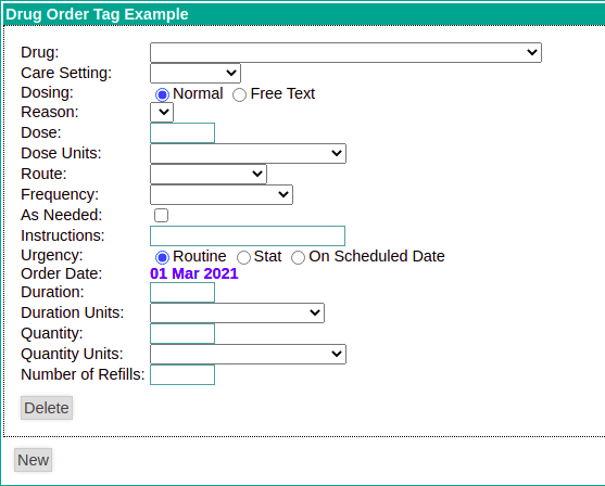
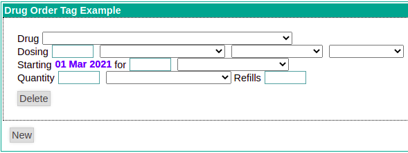
Order Actions Supported
| Description | Entering / viewing the order |
|---|---|
Placing a new OrderOne is able to place a new Order within the encounter any of the configured orderables (concepts / drugs). It is possible to configure what is available to be ordered. For example:
|
|
Modifying existing ordersIf a patient has active orders for concepts associated with the configured tag on the form, then upon editing the form, these orders will appear in the "Active Order" section with actions that allow them to be revised, renewed, or discontinued. | |
Revising an existing order Once an order has been entered, if any changes need to be made to this, this is done through a REVISE order. This applies both for editing an order within the same encounter that it was created within, or for making changes to it. When REVISE is selected, all of the order properties are defaulted to their current values, to facilitate making changes. When revising an order within the same encounter in which it was previously created, the prior order is voided, and the revision is recorded as a NEW order. To the right, we see ourselves revising the above order on September 1, 2020. |
|
Renewing an existing order Once an order has been entered, a subsequent encounter that occurs while this order is active has the option available to RENEW the order. Renew is not available when you are editing an order within the encounter in which it was previously created. Renew differs from REVISE in that none of the fields related to dosing are editable. One can only modify the duration, quantity and refills as appropriate. |
|
Discontinuing an existing order For any active order on a given encounter date, one can also choose the option of discontinuing that order. If a discontinuation order is issued in the same encounter in which the order was originally placed, this will not create a discontinue order in the system, but will rather VOID the previously created order. |
|
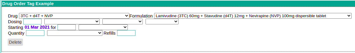
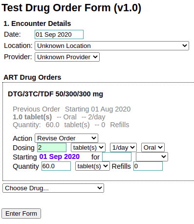
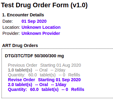
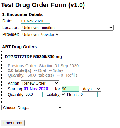
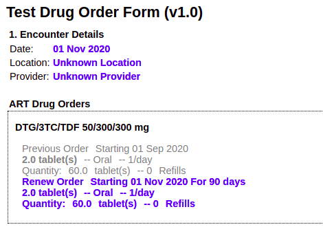
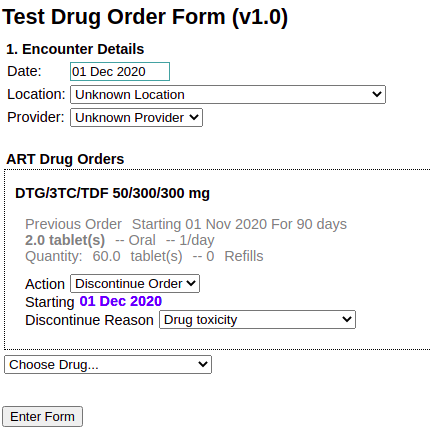
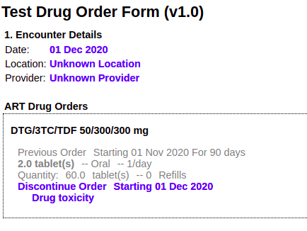
Relation to encounter date
As htmlformentry is primarily a tool for recording encounter-based data, all ordering is done as of the encounterDate. All orders are created with a dateActivated equal to the encounterDate, and all available actions relate to the existing orders (if any) that are active on the encounter date. This is why you will see that the "Start Date" of the order is view-only and will always match the encounter date. For this reason, any changes to the encounter date on a given form have an impact on order data. Specifically, when an encounter date is changed, all existing drug order tags must be recreated from scratch in order to ensure that they account for the actions that are possible on any existing orders that might be present on that date. For the end user, this may result in clearing out previously entered form fields that will need to be re-entered. To inform the user of this, a pop-up alert has been added to the system when such a situation is found, demonstrated in the image to the right. |
|
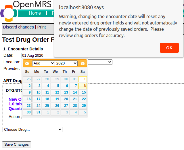
<page>
Tag used to split a form into multiple pages. If you decide to use it, all other tags have to be inside it with the exception of <style><script> which can either be inside or outside.
Attributes
- title: Specifies the page title.
- OPTIONAL
- Example: <page title="Page1"/>
- Default: Tab{Number}
Example Usage
<htmlform>
	<style></style>
    <script></script>
<page title="pageOne"> Content shown on page one goes here</page>
<page title="pageTwo">Content shown on page one goes here</page>
<page title="pagethree">Content shown on page one goes here</page>
</htmlform>
<patient>
The patient tag can be used to create a new patient or edit an existing patient within an HTML Form. The tag allows to reference age/birthdate, gender, name, address, identifier.
(Note that there is no way in the current UI to access a form without already being in the context of specific patient, so, in the current UI you can only edit, not create, a patient using this tag. In custom code, if you intend to load a form without specifying a patientId or personId as a parameter, make sure set mode=enter when calling the html form entry controller.)
- since: 1.7.2
Attributes
- field:
- Example: <patient field="name" />
- Value: see table
- Default:
Attribute field | Additional attribute | Is mandatory while enter/create | Description | Example |
|---|---|---|---|---|
name | Yes | Display the name fields (first name, family name, title, etc) based on the global variable layout value | <patient field="name" /> | |
gender | Yes | Display Male / Female option in drop down combo box | <patient field="gender" /> | |
birthDate | Yes | Display the birth date input text box with calendar widget support | <patient field="birthDate" /> | |
age | Yes | Display the age input text box with the validation of 0 <= age <= 200 | <patient field="age" /> | |
birthDateOrAge | Either birth date or age | Display both birthday and age input text boxes (birthdate field has the high priority) | <patient field="birthDateOrAge" /> | |
identifier | Yes | Display identifier input text box and identifier types in drop down combo box | <patient field="identifier" /> | |
identifier | identifierTypeId | Yes | If you pass identifierTypeId attribute along with Identifier tag, only identifier input text box will display | <patient field="identifier" identifierTypeId="xxx"/> |
identifierLocation | Yes | Display the available locations in drop down combo box (note that there is an open bug concerning this attribute...see HTML-414 | <patient field="identifierLocation" /> | |
address | No | Display the address fields (add1, add2, zipcode, etc) based on the global variable layout value | <patient field=”address” /> |
- required: (currently only applies to patient identifier fields)
- Example: <patient field="identifier" identifierType="2" required="false" />
- Default: true
Example Usage
<patient field="name"/> <!-- displays the name fields -->
<patient field="identifier" identifierTypeId="2"/>  <!-- displays identifier field for identifier type 2 - input is validated accordingly  -->
<postSubmissionAction>
Since 2.4
Lets run server-side Java code as part of a form's submission. This action happens after standard form processing (e.g. obs are created) but it happens in the same transaction, so if this processing throws an error, the entire form submission is invalidated.
Attributes
- class
- required
- value: the fully-qualified classname of a Java class that implements the interface org.openmrs.module.htmlformentry.CustomFormSubmissionAction
- example:
<postSubmissionAction class="org.openmrs.module.xyz.DecideWhereToRedirect"/>
<redirectOnSave>
(Since 2.4)
Lets a form indicate what URL to go to after it is submitted, overriding the default behavior of the web framework.
Attributes
- url: url template to redirect to
- optional, but you must specify exactly one of url and script
- value: an url template, that will support substitution of {{patient.id}} and {{encounter.id}}
- Note that since the entire HTML form is XML, you may need to replace the & signs in the URL with &
example:
<redirectOnSave url="/modules/custom/displayForPrinting.form?patientId={{patient.id}}&encounterId={{encounter.id}}"/> <redirectOnSave url="/module/reporting/reports/renderReport.form?reportDefinition=76cfc87a-9e88-4d39-acc7-ed68d4beb1f7&patient_wanted={{patient.id}}&renderingMode=org.openmrs.module.reporting.report.renderer.TextTemplateRenderer!d45c199d-c004-4ee4-aa8d-6a8061d7d9a5"/>
- script: lets you dynamically compute an url template to redirect to
- optional, but you must specify exactly one of url and script
- value: the name of a ScriptEngine configured on your JVM. (Only "groovy" is officially tested, but others should work.)
- If you specify a script attribute, then the content of the redirectOnSave tag must be the script itself.
- Note that since the entire HTML form is XML, you will need to escape entities like &, <, and >.
example:
<redirectOnSave script="groovy"> import org.openmrs.api.context.Context; def customView = Context.getAdministrationService().getGlobalProperty("custom.view"); return "custom.form?view=" + customView + "&patientId={{patient.id}}"; </redirectOnSave>
<relationship>
(Since 1.7.4.)
Used to add relationships for a patient. The tag allows you to replace existing relationships or add new relationships, it does not currently support editing and deleting existing relationships.
Attributes
- type: this is the relationship_type_id (or UUID) for the relationship that should be created for the selected person.
- REQUIRED
- Examples
- <relationship type="1" whoAmI="A" changeExistingRelationship="true" />
- <relationship type="0cbe2ed3-cd5f-4f46-9459-26127c9265ab" whoAmI="A" changeExistingRelationship="true" />
- Value: Any valid relationship type ID or UUID for a relationship type
- Default: NONE
- whoAmI:this is the side of the relationship the patient the form is being entered on is. For example in a Parent to Child relationship, if the form is being filled out for the child then the whoAmI value should be set to "B" whereas if the form is being filled out for the parent then the whoAmI value should be set to "A"
- REQUIRED
- Examples
- <relationship type="1" whoAmI="A" changeExistingRelationship="true" />
- <relationship type="1" whoAmI="B" changeExistingRelationship="true" />
- Value: "A" or "B"
- Default: NONE
- changeExistingRelationship: this attribute determines if new relationships should be added in addition to existing relationships or should replace the existing relationships of that type. So if this value is set to true, any existing relationships of that type will be replaced. If the attribute is set to false then a new relationship will be added in addition to any existing relationships.
- REQUIRED
- Examples
- <relationship type="1" whoAmI="A" changeExistingRelationship="true" />
- <relationship type="1" whoAmI="A" changeExistingRelationship="false" />
- Value: "true" or "false"
- Default: NONE
- required: this is used for validation, and if true the form will not be able to be submitted without the required relationships existing for the patient. The code checks to see if the patient already has relationships existing, so validation will not fail if the required relationship types were set up prior to entering the form (in this situation the data entry clerk can edit or add new relationships or just ignore the question). The relationship widget displays to the user all existing relationships (for the types we care about in the tag), so the data entry clerk should be able to decide if entry on this question is needed.
- OPTIONAL
- Examples
- <relationship type="1" whoAmI="A" changeExistingRelationship="true" required="true" />
- <relationship type="1" whoAmI="A" changeExistingRelationship="true" required="false" />
- Value: "true" or "false"
- Default: false
- requireAttributes: this attribute restricts the search results based on person_attributes. This attribute takes in a comma separated list of attributes. Each attribute can be entered as a name value pair (separated by a ',' for example Health Center:Rwinkwavu Health Center. Alternatively the attribute value can be entered in the format of ${currentPatientAttribute("Health Center")}, in this case the relationship tag will retrieve the value of Health Center attribute for the patient of the form and use this value as the valueto match. The value for the attribute is optional, and if left out then the search will return any people that possess the specified person_attribute. If multiple attributes are specified, only persons that match allof the specified attributes are displayed.
- OPTIONAL
- Examples
- <relationship type="1" whoAmI="A" changeExistingRelationship="true" requireAttributes="Health Center:Rwinkwavu Health Center" />
- <relationship type="1" whoAmI="A" changeExistingRelationship="true" requireAttributes="Health Center:${currentPatientAttribute("Health Center")}" />
- <relationship type="1" whoAmI="A" changeExistingRelationship="true" requireAttributes="Health Center" />
- <relationship type="1" whoAmI="A" changeExistingRelationship="true" requireAttributes="Health Center:Florida,Citizenship:USA" />
- Value: any valid person attribute type and optionally the value the person attribute should have.
- Default: NONE
- programIds: this attribute allows the search results to be filtered based on program enrollment. So this takes in a comma separated list of the program ids (or UUIDs). This can be used in conjunction with the personAttributes if necessary. If multiple programs are specified, only patients in allof the specified programs are displayed.
- OPTIONAL
- Examples
- <relationship type="1" whoAmI="A" changeExistingRelationship="true" programIds="1" />
- <relationship type="1" whoAmI="A" changeExistingRelationship="true" programIds="1,5" />
- <relationship type="1" whoAmI="A" changeExistingRelationship="true" programIds="0cbe2ed3-cd5f-4f46-9459-26127c9265ab" />
- Value: Any valid program ID, program UUID or underlying concept name
- Default: NONE
- display: This attribute determines which widget is displayed to the user to pick the person for the relationship. A value of “search” will present the user with a popup search box, allow them to enter a search term then select from the returned list. All searches in the tag search are based on person not patient, however you can search on patient identifiers and it will work. A value of “dropDown” presents the people in a simple drop down. If the drop down list is used when a large number of people are returned then this slows down the loading of the form, so drop down box option can only be used in conjunction with the requireAttributes and/or programId fields.
- OPTIONAL
- Examples
- <relationship type="1" ="1" whoAmI="A" changeExistingRelationship="true" display="search" />
- <relationship type="1" ="1" whoAmI="A" changeExistingRelationship="true" display="dropDown" />
- Value: "search" or "dropDown"
- Default: search
Example Usage
<relationship type="21" whoAmI="A" required="true" changeExistingRelationship="false"
	requireAttributes="HealthCenter:${currentPatientAttribute("Health Center")" programIds="3"display="search" labelText=”label” />
<render>
See <repeat>
<repeat>
Repeatedly renders code that is contained within template tags. Facilitates future code maintenance. Repeats can be nested inside of other tags. A repeat can contain only 2 top level tags: template and render.
Related Tags
<template>
- The code contained in the <template> tags is repeated for each <render> tag.
<render>
- Used within a repeat tag to render code. Within the render tag you can also specify attributes that can be used as keys during substitution.
Example Usage
<repeat>
    <template>
        <obsgroup groupingConceptId="1295">
            <tr>
                <td><obs conceptId="1297" answerConceptId="{concept}" answerLabel="{effect}" labelText=""/></td>
                <td><obs conceptId="3063"/></td>
                <td><obs conceptId="1300"/></td>
                <td><obs conceptId="1643"/></td>
            </tr>
        </obsgroup>
    </template>
    <render concept="6355" effect="Nausées/vomissements"/>
    <render concept="16" effect="Diarrhée"/>
    <render concept="80" effect="Arthralgie"/>
    <render concept="877" effect="Etourdissements et/ou vertiges"/>
</repeat>
<repeat with="">
(Available in HFE 2.0.2 and above)
A less-verbose version of the <repeat> tag.
Attributes
- with: Defines all the item
- REQUIRED
- Value: All the items that should be rendered with tag element, defined within single quotes. Supports 1 to n sets, and 1 to n items in each set.
- Example:<repeat with="['664','No Complaints'],['832','Weight Loss']">
Example Usage
<repeat with="['664','No Complaints'],['832','Weight Loss'],['777','Nausea']">
<obs conceptId="1069" answerConceptId="{0}" answerLabel="{1}" style="checkbox" /><br/>
</repeat>

would render as:

<obs conceptId="1069" answerConceptId="644" answerLabel="No Complaints" style="checkbox" /><br/>
<obs conceptId="1069" answerConceptId="832" answerLabel="Weight Loss" style="checkbox" /><br/>
<obs conceptId="1069" answerConceptId="777" answerLabel="Nausea" style="checkbox" /><br/>
Note
In order to work, the opening tag must end with exactly the following:
]">
That is, close-square-bracket followed by double-quote followed by greater-than. No space is allowed.
<restrictByRole>
A user with a particular role can be restricted from either viewing a certain HTML form (or a section in the form) by using the <restrictByRole> tag.
Attributes
- include: Defines all the user roles for whom the tag content should be included
- REQUIRED (Either include or exclude field)
- Value: A comma seperated list of user roles
- Example:<restrictByRole include="System Developer,Provider"/>
- Default: None
- Since: 1.11
- exclude: Defines all the user roles for whom the tag content should be excluded
- REQUIRED (Either include or exclude field)
- Value: A comma seperated list of user roles
- Example:<restrictByRole exclude="Data Manager"/>
- Default: None
- Since: 1.11
<section>
The <section> tag lets you break your form, and corresponding form schema, into sections. Note that we wrote this tag before HTML 5 introduced a real-HTML section tag, so the default behavior of this tag outputs a div.
Attributes
- headerCode: Allows you specify the header label using a code that references message.properties or the translation mappings in the form itself.
- OPTIONAL
- Example: ???
- Value: ????
- Default: None.
- headerLabel: The label to use in the section header.
- OPTIONAL
- Example: <section headerLabel="1. Information démographique">
- Value: Any quoted string
- Default: None.
- headerStyle: Allows you to override the default style for the section header. (Treated as a CSS class.)
- OPTIONAL
- Value: Valid CSS class names
- Default: sectionHeader
- sectionStyle: Allows you to override the default style for the section. (Treated as a CSS class.)
- OPTIONAL
- Value: Valid CSS class names
- Default: section
- sectionTag: Lets you specify what tag should be used for the section
- OPTIONAL
- Value: Valid HTML tag name
- Default: div
- Since: 2.0.3
- headerTag: Lets you specify what tag should be used for the section header
- OPTIONAL
- Value: Valid HTML tag name
- Default: span
- Since: 2.0.3
Example Usage
If you want to use HTML 5 section tags, do something like this:
<section headerLabel="Encounter details" sectionTag="section" headerTag="h1"> Your content </section>

<!-- This would be the output -->
<section class="section">
    <h1 class="sectionHeader">Encounter details</h1>
    Your content
</section>
<standardRegimen>
This tag lets you create/edit/discontinue standard regimens, which are managed in the xml file in the global property 'dashboard.regimen.standardRegimens'. In the htmlform, by just selecting a standard regimen and a start date, all the DrugOrders in the regimen will be created upon form submission. For EDIT/VIEW mode, htmlformentry will compare all DrugOrders in an Encounter and will choose the 'best matching' standard regimen if there are any. If any of the DrugOrders in an existing standard regimen have been modified outside of the tag, the standard regimen matching may fail (for example if one of the drugs in a regimen has a modified start or discontinue date than the other DrugOrders, the tag will NOT assume that these DrugOrders are part of the same standard regimen). In other words, all DrugOrders in a standard regimen are never really expected to be modifed outside of the htmlformentry context.
WARNING -- using this tag in a one-form per encounter workflow may cause duplicate drugOrders to be created. See the WARNING for DrugOrder. The same idea applies here too.
- since: 1.9.0
- No longer supported in htmlformentry version 4.0.0+ due to removal in OpenMRS 2.x platform
Attributes
- regimenCodes: Determines which regimens appear in the list
- REQUIRED
- Example: <standardRegimen regimenCodes="standardTri30,standardTri40" />
- Value: Comma separated list of regimenCodes from the standard regimen xml in the global property 'dashboard.regimen.standardRegimens'
- Default: None
- discontinuedReasonConceptId: This creates a drop-down of coded reasons for discontinuing a regimen. This covers the valueCoded reason for discontinuing a regimen, and I'm currently waiting on a bug fix to 1.6+ to be able to support a text field for 'other' for discontinueReasonText.
- OPTIONAL
- Example: <standardRegimenregimenCodes="standardTri30,standardTri40" discontinuedReasonConceptId="1252"/>
- Value: a valid conceptId or uuid for the concept representing the reason for discontinuing. This concept must have conceptAnswers.
- Default: none
- discontinueReasonAnswers: Allows you to explicitly set the possible list of discontinue reason answers. If not used, all ConceptAnswers for discontinueReasonConceptId will be used.
- OPTIONAL
- Example: <standardRegimen regimenCodes="standardTri30,standardTri40" discontinuedReasonConceptId="1252" discontinueReasonAnswers="102,105"/>
- Value: valid reasons for discontinuing. These concept should be a subset or all of the ConceptAnswers associated with the discontinuedReasonConceptId concept.
- Default: none
- discontinueReasonAnswerLabels: Allows you to specify labels for your discontinue reason answers
- OPTIONAL
- Example: <standardRegimen regimenCodes="standardTri30,standardTri40" discontinuedReasonConceptId="1252" discontinueReasonAnswers="102,105" discontinueReasonAnswerLabels="toxicity,defaulted"/>
- Value: text strings equal in number to the number of ConceptAnswers specified in discontinueReasonAnswers.
- Default: none
<submit>
You need to put a submit tag at the bottom of your form, or else your users will be very disappointed in you. Label, Code, Style attributes analogous to a section tag can be applied.
Attributes
- class: adds the specified class or classes the generated submit element in rendered HTML
- OPTIONAL
- Example: <submit class="input-element large"/>
- Value: string
- Default: None
- Version: Available since version 2.0.9
- submitLabel: Allows you to set the text of the submit button.
- OPTIONAL
- Value: Any String
- Default: Messages from message.properties for htmlformentry.enterFormButton or htmlformentry.saveChangesButton depending on if form new form is being saved or existing form is being edited, respectively.
- Since: 1.7.2
- submitCode: Allows you to set the text of the submit button using an htmlformentry translation code
- OPTIONAL
- Value: reference to a translation code
- Default: None
- Since: 1.7.2
- submitStyle: Allows you to set the style class for the submit button. This attribute gets written into the rendered submit tag as class="<<submitStyle Value>>".
- OPTIONAL
- Value: Valid CSS style attributes
- Default: submitButton CSS style is referenced by default; if none is defined in the style section, no style will be applied
- since: 1.7.2
Example
Simplest example using defaults
<htmlform>
    ...stuff goes here...
    <submit/>
</htmlform>
Example of applying custom Class to a translated label
<htmlform>
<style>
    .customSubmit { font-weight: bold; }
</style>
<translations defaultLocale="en">
    <code name="submit_text">
        <variant locale="en" value="Close Flowsheet"/>
        <variant locale="fr" value="Not sure how to say it in French"/>
    </code>
</translations>
    ...stuff goes here...
    <submit submitStyle="customSubmit" submitCode="submit_text" />
</htmlform>
<template>
See <repeat>
<translations>
Defines translation mappings at the top of the file which can be accessed by specialized coded attributes in other tags.
Attributes
- defaultLocale: Allows you to specify the default variant value.
- OPTIONAL
- Example: <translations defaultLocale="en">
- Value: Any quoted string.
- Default: None.
Related Tags
<code>
Used to define a code to assign variant values to.
Attributes
- name: Name of the variant
- REQUIRED
- Example: <code name="night_sweats">
- Value: Any quoted string.
- Default: None
<variant>
Used to identify the value for a code as determined by the locale.
Attributes
- locale: ????
- REQUIRED
- Example: <variant locale="en" value="night sweats"/>
- Value: A valid two letter locale value. E.g. "ar", "en", "es", "fr"
- Default: None
- value: The value to be assigned to the code.
- REQUIRED
- Example: <variant locale="en" value="night sweats"/>
- Value: Any quoted string.
- Default: None
Example Usage
<translations defaultLocale="en">
    <code name="night_sweats">
        <variant locale="en" value="night sweats"/>
        <variant locale="fr" value="sueurs nocturnes"/>
    </code>
</translations>

And then in the body of the form:

<obs conceptId="1234" labelCode="night_sweats"/>
or
<lookup expression="fn.message('night_sweats')"/>
<uiInclude>
This tag is only available when using the HTML Form Entry UI Framework Integration module and OpenMRS 1.9.3+. It lets you access resources provided by the UI Framework.
Attributes
- provider
- REQUIRED
- value: the name of the provider (typically the module that includes the resource you are including).
- javascript
- value: name of javascript file
- this will be relative to (provider)/omod/src/main/webapp/resources/scripts for a standard uiframework-driven module
- includes a javascript file in the <head> of the page (and avoids duplicate imports); equivalent to <% ui.includeJavascript(...) %> in a GSP
- value: name of javascript file
- css
- value: name of css file
- (provider)/omod/src/main/webapp/resources/styles for a standard uiframework-driven module
- includes a css file in the <head> of the page (and avoids duplicate imports); equivalent to <% ui.includeCss(...) %> in a GSP
- value: name of css file
- fragment
- value: name of fragment
- evaluates and includes a fragment inline in the html; equivalent to ${ui.includeFragment(...)} in a GSP
- image (since htmlformentryui version 2.1.0)
- renders an img tag with the src provided by the provider and fragment
- supports other arbitrary attributes on the img tag - whatever you put in the htmlformentry tag will be on the img tag other than "provider" and "image"
- example: <uiInclude provider="file" image="configuration/pih/images/heartFailureProtocol-en.png" alt="Heart Failure protocol" width="100%" />
- priority
- value: integer
- optional (defaults to 0)
- higher priorities will be included before other resources of the same type with a lower priority
You are required to specify one of javascript, css, or fragment.
Example Usage
<uiInclude provider="uicommons" javascript="angular.min.js"/>
<uiInclude provider="coreapps" javascript="diagnoses/diagnoses.js"/>
<variant>
See <translations>
<when>
Since: 2.1.6
Must be inside <obs id="..."><controls>...</controls></obs>. See <controls>.
An action that should be taken conditionally based on a chosen value of the <obs> it is in.
Attributes
- value
- REQUIRED
- value: the obs value to trigger on. Usually this will be a concept, by id, uuid, or mapping.
- thenDisplay
- optional
- value: the CSS selector of a DOM element to be shown only when the obs has the given value. If the obs has another value, this element is hidden, and any fields in it are cleared
- thenJavascript
- since 2.4
- optional
- value: an inline JavaScript snippet, called when the obs is set to the given value.
- elseJavascript
- since 2.4
- optional
- value: an inline JavaScript snippet, called when the obs is set to anything other than the given value.
It is valid to combine more than one of the then* attributes, though in practice you probably want either thenDisplay, or else thenJavascript + elseJavascript.
Example
<obsgroup groupingConceptId="PIH:9722">
    Form signed by role
    <obs id="form-signed-role" conceptId="PIH:TITLE WHO COMPLETED FORM" answerConceptIds="PIH:DOCTOR,PIH:NURSE,PIH:OTHER">
        <controls>
            <when value="PIH:OTHER" thenDisplay="#form-signed-role-other"/>
        </controls>
    </obs>
    <span id="form-signed-role-other">
        Specify:
        <obs conceptId="PIH:GENERAL FREE TEXT"/>
    </span>
</obsgroup>
<obsgroup groupingConceptId="PIH:9722">
    <p>
        <label>Form signed by role</label>
        <obs id="form-signed-role" conceptId="PIH:TITLE WHO COMPLETED FORM" answerConceptIds="PIH:DOCTOR,PIH:NURSE,PIH:OTHER">
            <controls>
                <when value="PIH:OTHER"
                    thenJavaScript="htmlForm.simpleUi.showField('form-signed-role-other')"
                    elseJavaScript="htmlForm.simpleUi.hideField('form-signed-role-other')"/>
            </controls>
        </obs>
    </p>
    <p id="form-signed-role-other">
        <label>Specify:</label>
        <obs conceptId="PIH:GENERAL FREE TEXT"/>
    </p>
</obsgroup>
<workflowState>
Used to transfer a patient into a certain program workflow state.
*Since 1.9*
Note: Due to the way the encounterDate tag works, it should always be placed BEFORE any workflowState tags on a form, to insure that the proper date is used when processing state changes
Note: This tag is intended to be used with encounter dates that have only a date component (not a date and time component). The tag may not always work in a logical manner when using encounter dates with a time component.
Attributes
- workflowId:
- REQUIRED
- Value: id or uuid of the workflow, or concept map reference to a concept associated with a workflow
- type
- Value: "radio", "dropdown", "checkbox", "hidden"
- Defaults to dropdown. Tells how to render the widget to select a state.
- In "radio" or "dropdown" mode the widget renders a list of the states in the workflow for selection by radio or dropdown respectively.
- If the patient is not currently in a state for that workflow, only states flagged as "initial" will appear, otherwise all states will appear
- (States that appear can be customized by the using the stateIds & stateLabels attributes)
- If the patient is currently in a state for that workflow, that state will be selected on form load
- Note that selecting a blank entry from a dropdown will do nothing--it will not take the patient out of his/her current state
- In "checkbox" mode, upon form submittal, if the checkbox is checked, the patient is transitioned into the state specified by the by "stateId" parameter
- If the patient is currently in the state specified by "stateId", the checkbox should appear checked
- Note that unchecking a checkbox will do nothing--it will NOT take the patient out of the state
- In "hidden" mode, the patient is automatically transitioned into the state specified by the "stateId" parameter (assuming they aren't already in that state)
- stateIds
- Only allowed if type="radio" or type="dropdown"
- List of ids, uuids, or concept maps for the states. There could be one or a comma-separated list. This is the list of states to be displayed as options.
- Only states within the specified workflow are allowed. Note that non-initial states will be suppressed from the display list if the patient is not currently in a state for the specified workflow.
- stateLabels
- Only allowed if type="radio" or type="dropdown"
- Matching text for the list of stateIDs. There could be one or a comma-separated list. If no labels are set, defaults to the preferred name of the concept backing the specified state
- stateId
- Mandatory if type="checkbox" or type="hidden", disallowed if type="radio" or type="dropdown"
- State to transitional the patient into, referenced by id, uuid or concept mapping
- stateLabel
- Only allowed if type="checkbox" or type="hidden"
- labelText: Sets the label that goes before the widget.
- labelCode: Allows you to reference a label by a messages.properties code or a code in the translation mappings defined in the form.
Example
<workflowState workflowId="12" labelText="Lunch" stateIds="0,6,8" stateLabels="The Pig,Au Bon Pain" style="dropdown" />
Notes
Since programs, workflows, and states are not tied to encounters, and forms and still (generally) modeled around encounters, it is not always obvious exactly how this tag should modify an existing workflow, especially when editing a form.
When submitting a new form, the patient is transferred into the selected state on the encounter date entered on the form. Also:
- If the patient is not enrolled in the program associated with the state, she is enrolled in the program on the encounter date.
- If the patient is currently in another state in the workflow on the encounter date, that state is ended on the encounter date.
- If the patient enters another state in the workflow after the encounter date, the new state added is ended on the date that this existing state starts.
- If the patient is already in the selected state on encounter date, no change is made
When editing an existing form, the logic is more complex:
- If there is no existing state for the selected workflow for the patient on the original encounter date, the same logic is followed as when entering a new form.
- Otherwise, the state selected on the form is compared to the current patient state at the time of the original encounter date. If these two states differ, change the existing patient state on the original encounter date is changed to the selected state.
- Regardless of whether or not the states differ, if the current patient state on the date of the original encounter date also started on the original encounter date, then:
- If the new encounter date is earlier than the original encounter date:
- The start date of the patient state on the original encounter date is moved to the new encounter date
- If there is an active patient state on the new encounter date, it is ended on the new encounter date
- If there are any other patient states between the new date and the original date, they are deleted
- The program enrollment date is moved earlier (to the new encounter date) if necessary
- If the new encounter date is after the original encounter date:
- The start date of the patient state on the original encounter date is moved to the new encounter date
- If there was a patient state just prior to the state we just shifted, it's end date is set to the new encounter date
- Exception: if the patient state on the original encounter date had an end date, and the new encounter date is after that end date, an exception is thrown
Other Examples and Tips
Javascript
You've always been allowed to write Javascript in an HTML form. There is some built-in Javascript helper functionality. The documentation for this has been moved to the HTML Form Entry JavaScript Reference page.
Including HTML character codes in HTML Forms
It is common to include the "non-breaking-space" character code within html:
<td>First Name</td>
However, the non-breaking-space character is, technically, is not valid XML. Since HTML forms must be valid XML, you will need to use the ASCII-code for a space as a substitution for the non-breaking-space character code:
<td>First Name</td>
There is currently a ticket about this issue: HTML-325
Linking to Pages
To make it seem like your html form has multiple pages, it would be best to put links to allow the user to jump down to the next page:
<a href="#page1">1</a>
Jump to Page: <b>1</b> \| <a href="#page2">2</a> \| <a href="#page3">3</a>
...
...
<hr/>
<a name="page2"></a>
Jump to Page: <a href="#page1">1</a> \| <b>2</b> \| <a href="#page3">3</a>
...
...
<hr/>
<a name="page3"></a>
Jump to Page: <a href="#page1">1</a> \| <a href="#page2">2</a> \| <b>3</b>
...
Features in Version 1.7
New features include access to past observations, as well as the logic service, from the lookup tag.
An example for first encounter location using logic:
<lookup expression="fn.logic('first encounterLocation')"/>
Or you could calculate the patient's BMI without using logic: (I know this is ugly. Blame the velocity templating language.)
Previous BMI:
<lookup complexExpression="#set( $wt = $fn.latestObs(5089) ) #set( $ht = $fn.latestObs(5090) ) #set( $bmi = $wt / ($ht * $ht) ) $\!{bmi}" />
Create your own custom tag and handler
It is possible to register your own tag and handler with htmlformentry from another module. For an example of this, see the htmlformflowsheet module.
<obs conceptId="1234" />Renders as a "Choose File" button. After chosen, the name of the file is beside it.
Legacy Versions of Tags
<drugOrder> tag prior to htmlformentry 4.0.0
WARNING -- using this tag in a one-form per encounter workflow may cause duplicate drugOrders to be created. For example, if a monthly rendez-vous form has a field for current regimen, broken down by specific drugs (like a chronic care form might, for example), it is tempting to include this tag in an htmlform replicating the paper encounter form. However, if the patient hasn't changed regimens, but the paper form has the regimen re-entered, you're going to end up with duplicate drugOrders, or worse, contradictory drugOrders if a regimen change has taken place, but the old drugOrders haven't been closed which has to be done currently outside of the htmlform (you'd have to open the original encounter during which the drugOrder was originally entered) . The 'best' and currently recommended use of this tag is in conjunction with the htmlformflowsheet module, which allows you to use htmlforms in a flowsheet-type patient chart. In this model of using the tag, all patient drugOrders across all relevant encounters (for example, all encounters with formId = 61, or even all encounters with encounterTypeId = 5) are loaded everytime you open the htmlform for the patient chart. With this method, you can use this tag to build the exact patient regimen that you want reflected on the patient dashboard, and in your database.
Data entry widget for recording drug order. The widget displays input fields for drug names (drop-down), dose, frequency, start date (calendar), end date (calendar), instructions, discontinueReason.
Note: regimens are currently not considered in this tag, just the basic DrugOrder object. Most of the design around this tag has been done within ticket HTML-120.
- since: 1.7.2
- attributes below starting with instructionsLabel will be available in 1.7.3
Attributes
- drugNames: Determines which drug names appear in the list
- REQUIRED
- Example: <drugOrder drugNames='kaletra' />
- Value: Comma separated list of drug id, drug name, drug UUID
- Default: None
- validateDose: Sets whether or not to validate the dose value (min, max of the dose)
- OPTIONAL
- Example: <drugOrder drugNames='kaletra' validateDose='true' />
- Value: true or false
- Default: false
- instructionsLabel: Renders a text box for entering instructions for the drug order.
- OPTIONAL
- Example: <drugOrder drugNames="d4T 30,d4T 40" validateDose="true" instructionsLabel="Drug Order Instructions: "/>
- Value: any text label for the instructions field
- Default:none
- drugLabels: This allows you to change the drug names that are displayed in the drop-down drug list. There have to be an equal number of drugLabels as drugNames to use this attribute, although validation will catch this if you forget.
- OPTIONAL
- Example: <drugOrder drugNames="RIF 300,RHEZ,PZA 500,NVP Susp" drugLabels="RIF,RZ, PZ, NVP Syrup" />
- Value: a comma-delimited set of drug names. Names will be applied to the drugs in the drugName attribute, in order.
- Default: none
- NOTE: Adding Drug Type Headers to the dropdown list: Also, I added a hacky syntax to the drugName attribute what can allow you to put drug type headers in the drugName dropdown widget. To insert a drug type header into the drug list, in the drugName list, you just insert the header with the forward-slash '/' character at the beginning and end of the drugName. For example, this is a valid tag: <drugOrder drugNames="RIF 300,RHEZ,PZA 500,/Syrups/,NVP Susp" drugLabels="RIF,RZ, PZ, NVP Syrup" hideDoseAndFrequency="true"/>. You'll notice that the drugNames attribue has 5 entries and the drugLabels attribute has only four labels. This works because the /Syrups/ isn't a real drug, so it isn't considered during validation. Finally, I've added validation that doesn't allow you to select a drug type header as a drug.
- hideDoseAndFrequency: Allows you to hide the dose and frequency text boxes that are rendered by the tag by default
- OPTIONAL
- Example: <drugOrder drugNames="RIF 300,RHEZ,PZA 500,/Syrups/,NVP Susp" drugLabels="RIF,RZ, PZ, NVP Syrup" hideDoseAndFrequency="true"/>
- Value: true/false
- Default: false
- NOTE: If this tag is used the drug order will be submitted using the drug strength from the concept drug definition.
- checkbox: This renders a checkbox for choosing to create a drugOrder for a single drug listed in the drugName attribute. Works nicely with the "hideDoseAndFrequency" tag above. This tag will only be applied if there is EXACTLY one drug listed in drugName, and the select attribute is set to "true".
- OPTIONAL
- Example: <drugOrder drugNames="Terizidone (Trd)" drugLabels="TRD" checkbox="true" hideDoseAndFrequency="true"/>
- Value:true/false
- Default: false
- discontinuedReasonConceptId: This creates a drop-down of coded reasons for discontinuing a regimen. This covers the valueCoded reason for discontinuing a regimen, and I'm currently waiting on a bug fix to 1.6+ to be able to support a text field for 'other' for discontinueReasonText.
- OPTIONAL
- Example: <drugOrder drugNames="d4T 30,d4T 40" validateDose="true" instructionsLabel="INSTRUCTIONS:" discontinuedReasonConceptId="1252"/>
- Value: a valid conceptId or uuid for the concept representing the reason for discontinuing drug question. This concept must have conceptAnswers.
- Default: none
- showOrderDuration: This creates a text field that allows you to say what the duration of the order should be. This, then, is applied as an autoExpireDate.
- OPTIONAL
- Example <drugOrder drugNames="Nelfinavir,Tenofovir (TDF)" showOrderDuration="true" />
- Value: true/false
- Default: false
- defaultDose:This sets a default dose that will be pre-entered in the drug order entry widget
- OPTIONAL
- Example <drugOrder drugNames="Ibuprofen" defaultDose="250"/>
- Value: empty string or a string that can be converted to a Double
- Default: none
- toggle: For checkbox style fields only, specify the id of a div or span that you wish to hide or disable depending on whether the checkbox is checked or not.
- OPTIONAL
- The toggle attribute accepts two syntaxes (see below).
- Basic: The basic syntax simply accepts the DOM id of the target div or span:
<obs conceptId="12" answerConceptId="116" answerLabel="Patient has a hat" style="checkbox" toggle="hatColors"/>

<div id="hatColors">
   What color is your hat?
   <obs conceptId="101" answerConceptIds="309,374,377" answerLabels="red,green,blue" style="radio"/><br/>
   <obs conceptId="103" answerConceptId="394" answerLabel="Hat is warm" style="checkbox" id="hatWarmInd"/>
</div>
- Advanced: The more advanced syntax accepts a JSON structure with the attributes: id and style. The "id" attribute is the DOM id of target div/span that you wish to hide or disable. The "style" attribute accepts either "hide" (default) or "dim". The "hide" style completely hides the target div/span until the checkbox is checked. The "dim" style greys-out and disables the child components of the target div/span until the checkbox is checked.
<obs conceptId="12" answerConceptId="116" answerLabel="Patient has a hat" style="checkbox" toggle="{id: 'hatColors', style: 'dim'}"/> <div id="hatColors"> What color is your hat? <obs conceptId="101" answerConceptIds="309,374,377" answerLabels="red,green,blue" style="radio"/><br/> <obs conceptId="103" answerConceptId="394" answerLabel="Hat is warm" style="checkbox" id="hatWarmInd"/> </div>- Advanced: This syntax accepts the same toggle attribute but works with repeat tags, obsgroups, and tables.
            <repeat>
                <template>
                    <obsgroup groupingConceptId="PIH:Family planning construct">
                        <tr>
                            <td id="{comment}-fp">
                                <obs conceptId="CIEL:374"
                                     answerConceptId="{fpMethod}"
                                     style="checkbox"
                                     toggle="{id: '{comment}-date', style: 'dim'}"
                                />
                            </td>
                            <td class="{comment}-date">
                                <obs conceptId="CIEL:163757"/>
                            </td>
                            <td class="{comment}-date">
                                <obs conceptId="CIEL:163758"/>
                            </td>
                        </tr>
                    </obsgroup>
                </template>
                <render fpMethod="CIEL:780" comment="Pill"/>
                <render fpMethod="PIH:907" comment="Depo-provera"/>
                <render fpMethod="CIEL:5622" comment="Other"/>
            </repeat>
- Version: Available since version 1.11.0
Example Usage
<drugOrder drugNames='d80af3ef-ca9f-11de-ac93-672ba0a04471, 17, kaletra' />        <!-- list of drugs is generated using UUID, ID and drug name -->
<drugOrder drugNames='d80af3ef-ca9f-11de-ac93-672ba0a04471' validateDose='true'/>  <!-- dose value will be validated (min, max value) -->