HFED User Guide
Getting Started
Check the Installation Guide for installing this module.
Start by creating or editing an existing HTML Form:
Administration -> HTML Form Entry -> Manage HTML Forms
Overview
The HTML Form Entry Designer module transforms the HTML Form Entry module text area for entering HTML code into a WYSIWYG editor, while adding buttons for switching between design and code view. This editor is an extended version of CKEditor for supporting the special HTML language of HTML Form Entry module.
The following picture provides a general overview of the main interface of the editor: 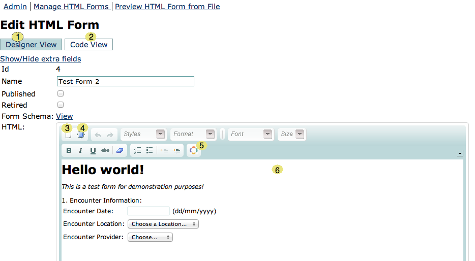
- Designer View - The WYSIWYG view of the editor, selected by default when the page is opened.
- Code View - The HTML Form Entry code generated by the designer. You can also edit this code and see your changes reflected on the designer. Be careful for keeping your XHTML syntax clean, or else you could break the code.
- New Page - this button clears the contents of the editor
- Maximize - this button maximizes the editor into the full width of the browser. Very useful so you can have a clear workspace for working.
- Add Element - the button with the OpenMRS logo as icon is where the fun begins! Adds special content provided by the HTML Form Entry module. See UI Elements for more information.
- Editor Area - this is where you edit things and place your cursor to insert them.
UI Elements
HTML Form Entry Designer module provides some common widgets (elements) that will help you create the special content for your HTML forms. The UI Elements provided are still growing in quantity and quality, the plan is to have elements for all the common tasks.
A list of the UI Elements in the Designer is available here.
By clicking on the Add Element icon (with the OpenMRS logo) you can choose what Element to add: 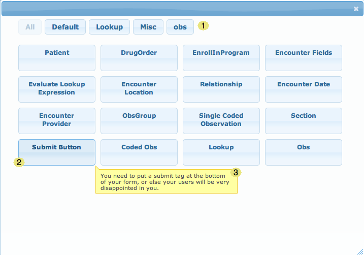
- Tag Area - In this area you can limit what elements are shown, depending on its category. For instance, Default elements only show elements that are generated from the HTML Form Entry module, while obs elements only show elements related to the obs tag.
- Element - This is one example of a UI Element. By clicking on this you will be taken to the Element Editor dialog, where you can fill the information needed to add this element.
- Description - By hovering over an Element, a tooltip with its description will appear.
Some of the UI Elements (with the "Default" tag) are generated automatically from the HTML Form Entry module, so the Designer is always up to date with recent version of this module.
After clicking on an Element, you can fill more information, in order to insert it on the editor: 
- Back Button - Takes you back to the Add Element dialog.
- Editor Area - This depends on the Element you are editing. Most of the time it will be attribute fields just like that.
- Attribute Information - Some attributes may have a description associated. Just hover this icon to see it.
- XML Preview - Get a preview of the XML code that will be generated with those attributes
- Preview - Get a preview of how the element will appear on the form.
- Add Element - This will add the element in the editor. Some basic validation will be provided, it won't let you add if it has errors.
Editing an Element
After adding an Element you can Edit or Delete it using the Right-Click of the mouse in the element. Elements are highlighted on the designer with a green background (if they are generated elements) or with a green border (for all the other elements).
By right-clicking on the element, the context menu will appear, allowing you to:
- Edit Element - Shows the Editor dialog, that allows you to edit the element
- Edit Container Element - Edits a container element (like section, obsgroup). If the elements are nested, they will appear in hierarchical order in the menu
- Remove Element - Deletes the element from the editor
- Ungroup Element - Transforms a custom element into a collection of generated elements and HTML code.